
flowtopia fest Brand
Came up with a concept for a hip hop musical event called Flowtopia Fest consisting of deliverables like logo system, promotional poster, VIP tickets, web pages, a step-and-repeat backdrop banner, and optional swag.
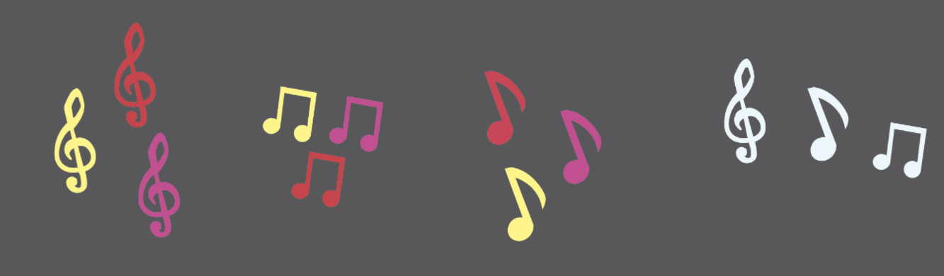
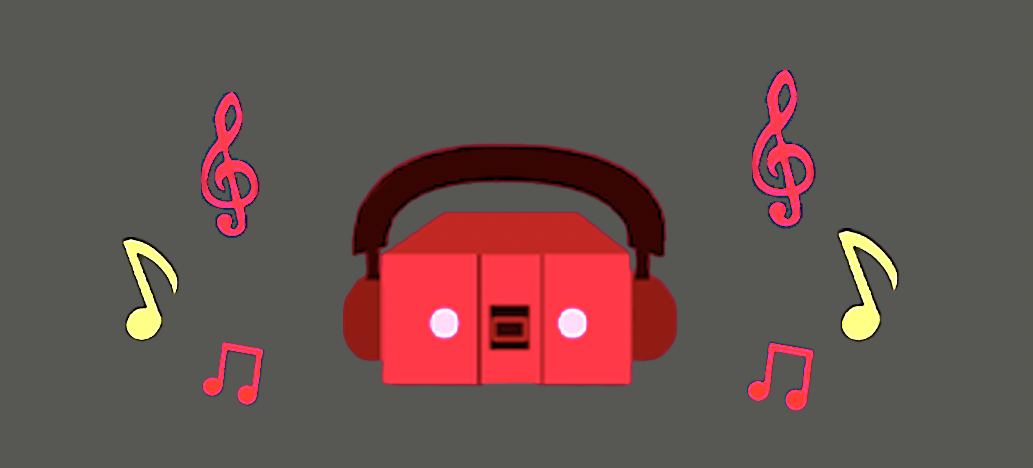
assets
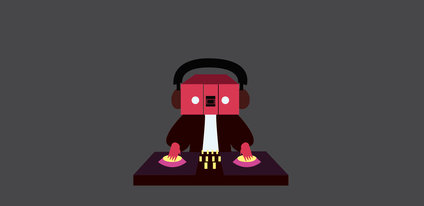
I chose to use the boom box head and music notes for my assets. The music notes were used to go with the music theme of the festival while the boombox head was meant to be another icon and design for the festival and resonates with the logo.
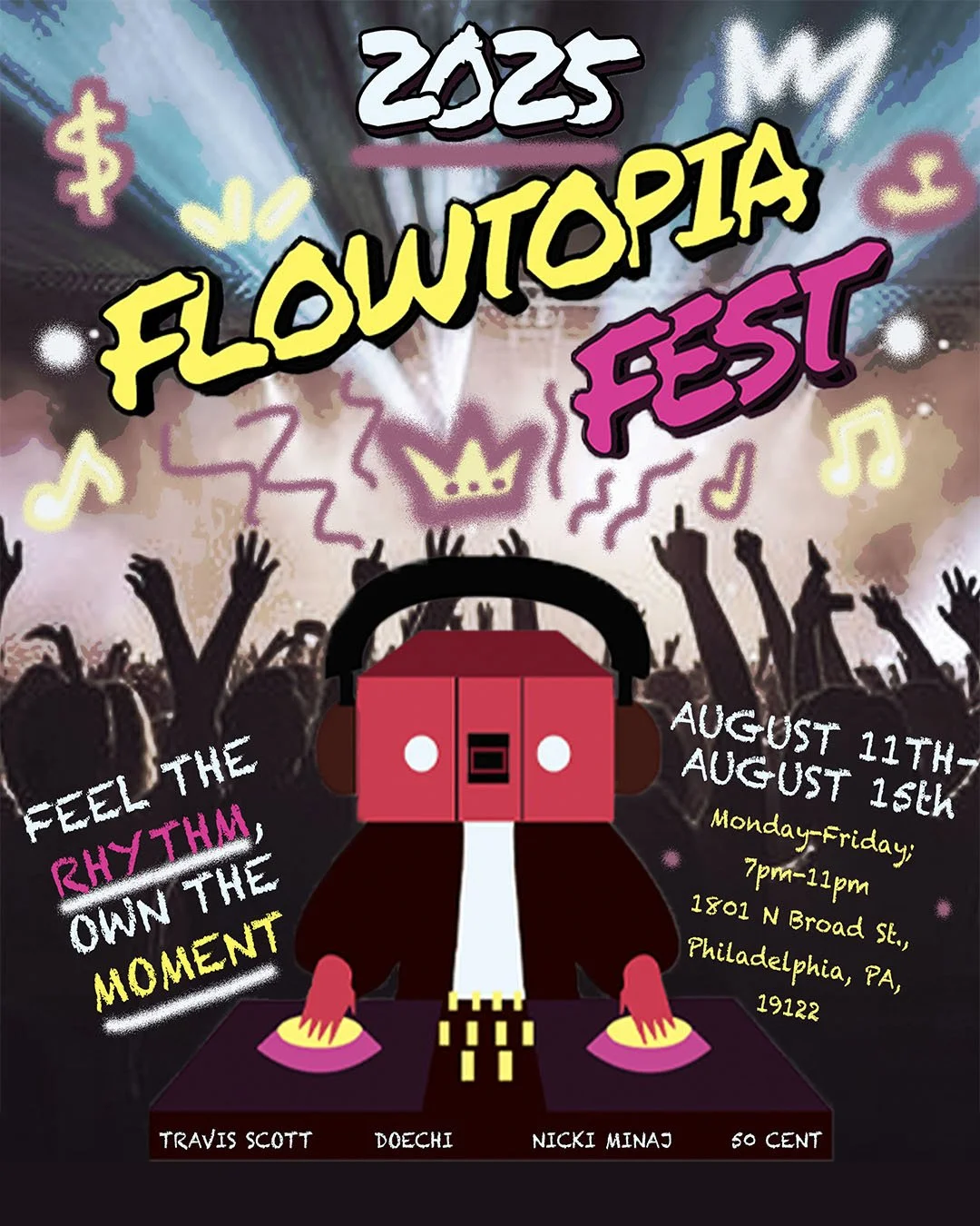
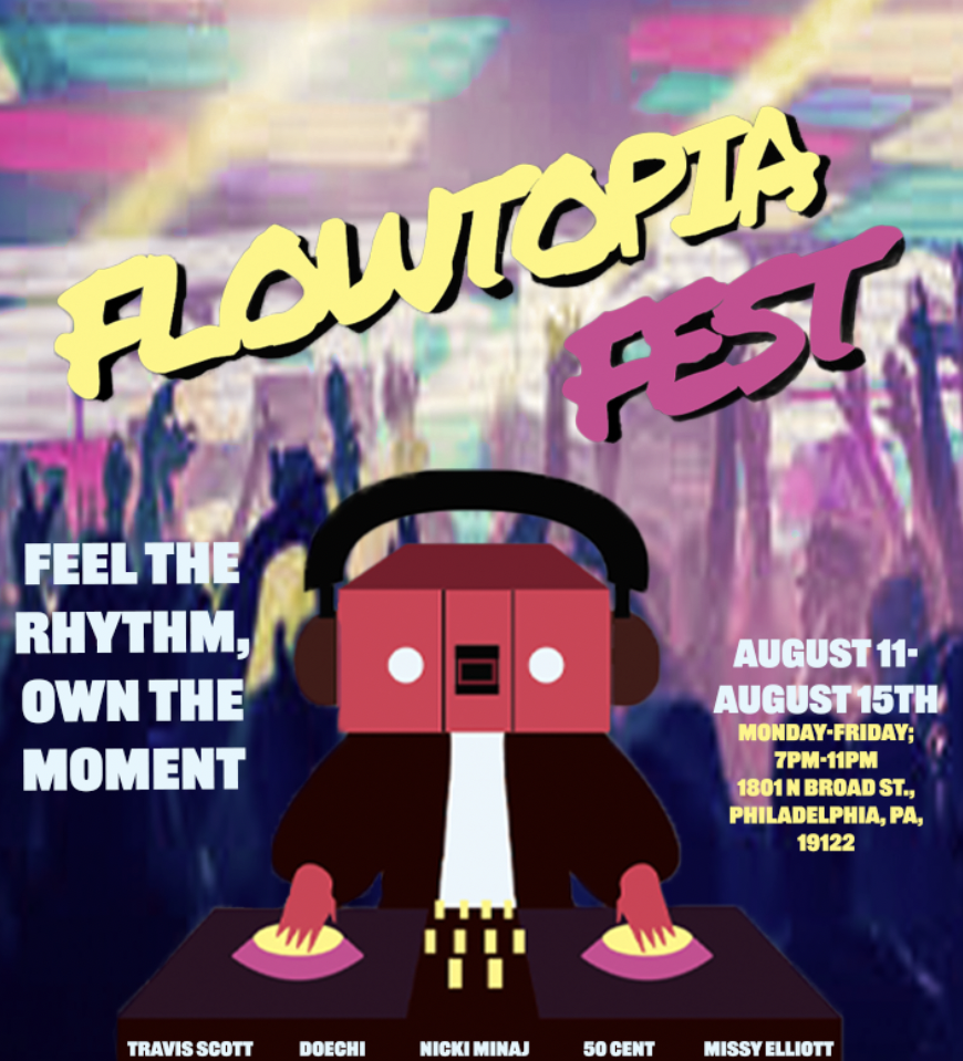
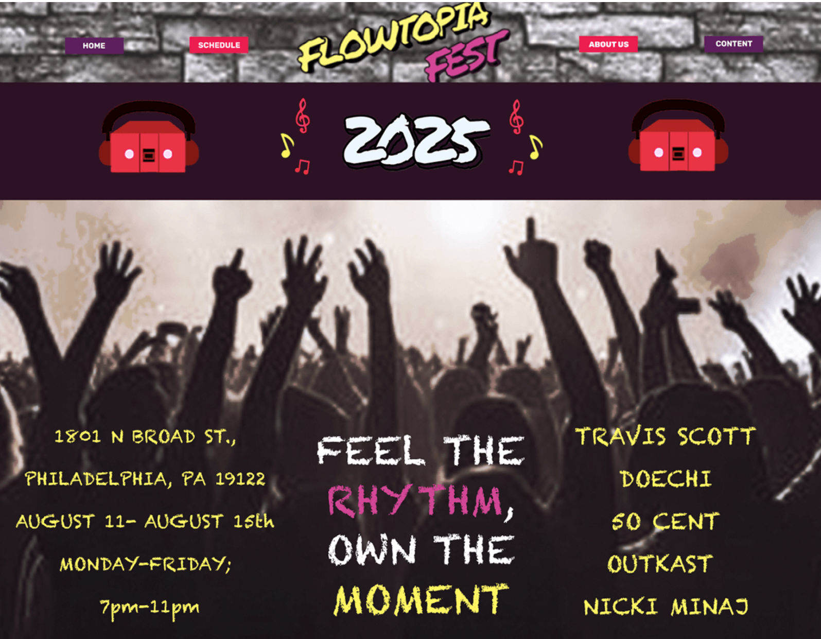
Poster
The poster was inspired by a party, concert, or a function where the crowd is getting amped by the music. This also goes with the idea of the character in the logo being a DJ hosting this event that brings people together to enjoy hip hop. I ultimately chose to make the poster have similar colors to the logo to add more of a partying at night kind of vibe.

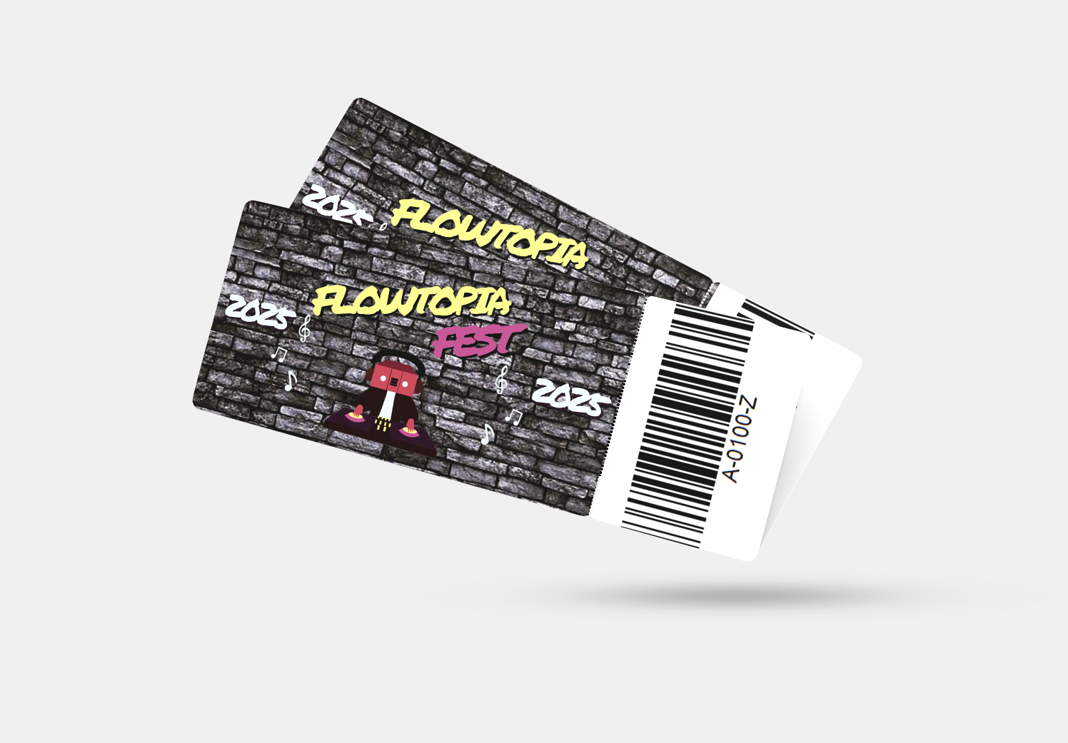
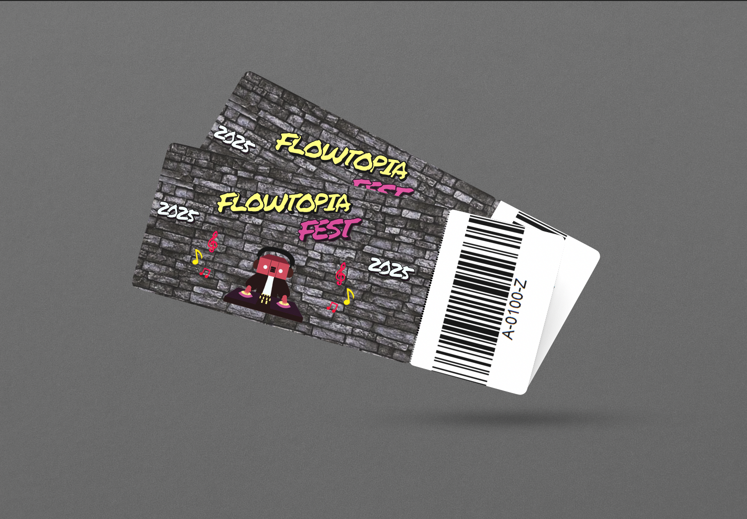
Tickets
The tickets were inspired by what I wanted to do for the logo. Originally, I wanted the logo to contain music notes around it to add to the logo but chose to add them in designs as opposed to all of my designs for this festival. I went with a brick wall to represent the street aspect of hip hop culture.
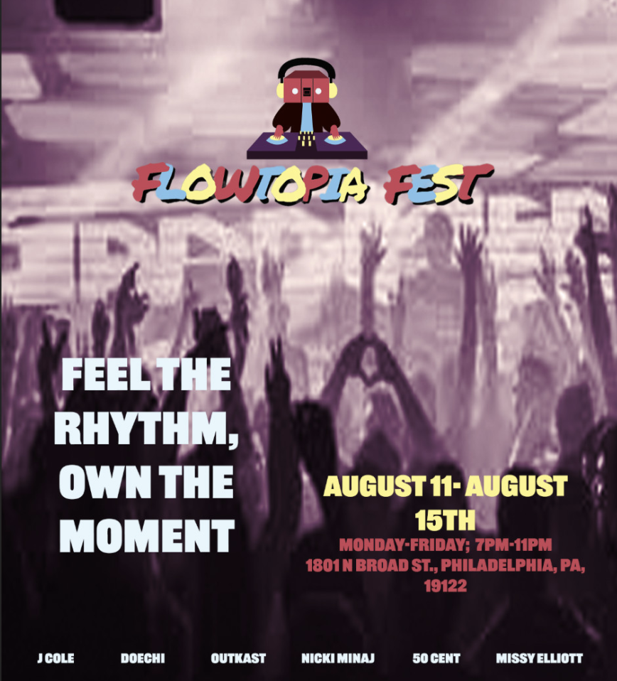
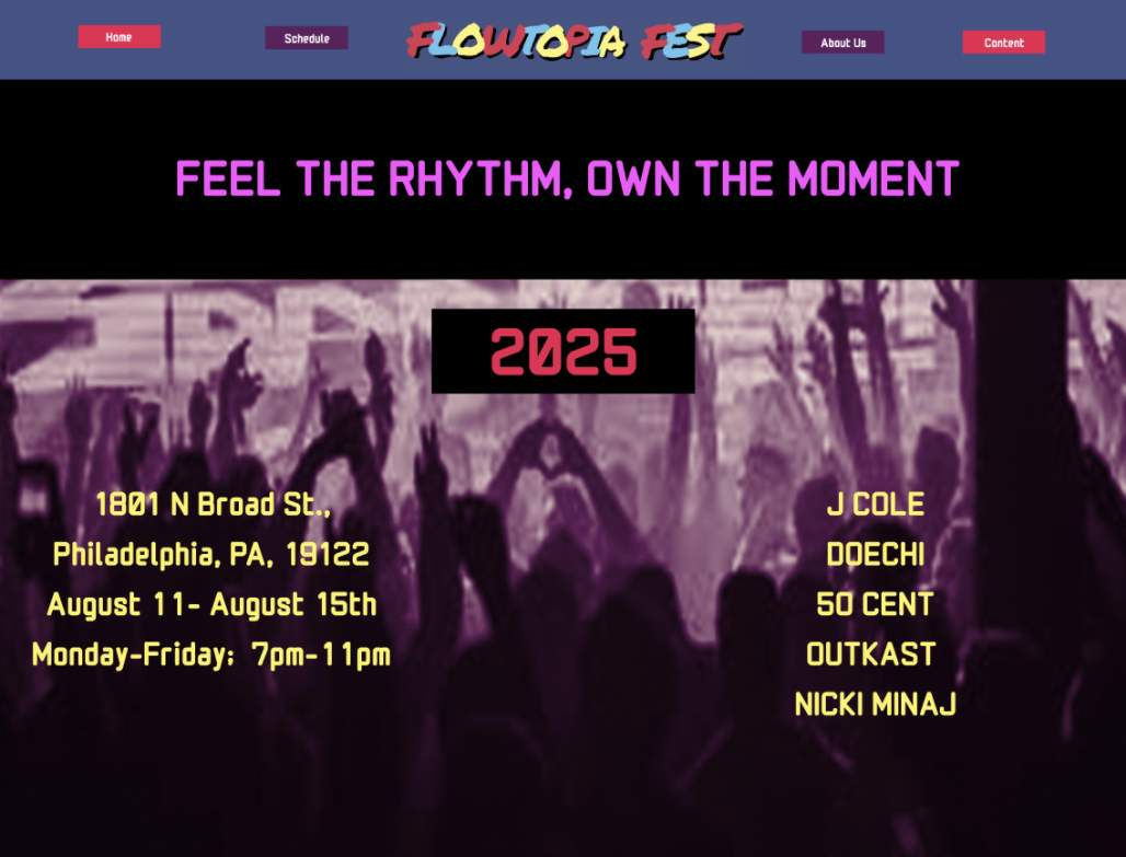
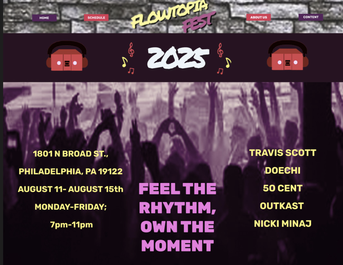
Website
The website was made after the poster and has some similarities in them. I chose to use similar designs for the two because I felt like its translation to a website would work well. I made different changes to it by setting it up the home buttons, adding the boombox head to it in place of putting the logo everywhere, used a different crowd image, and reformatted where I wanted the copy lines and information for the event.
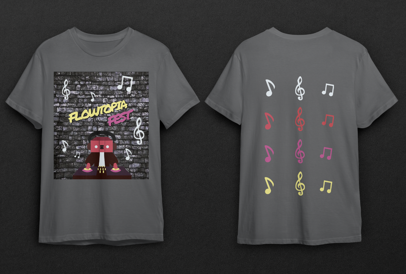
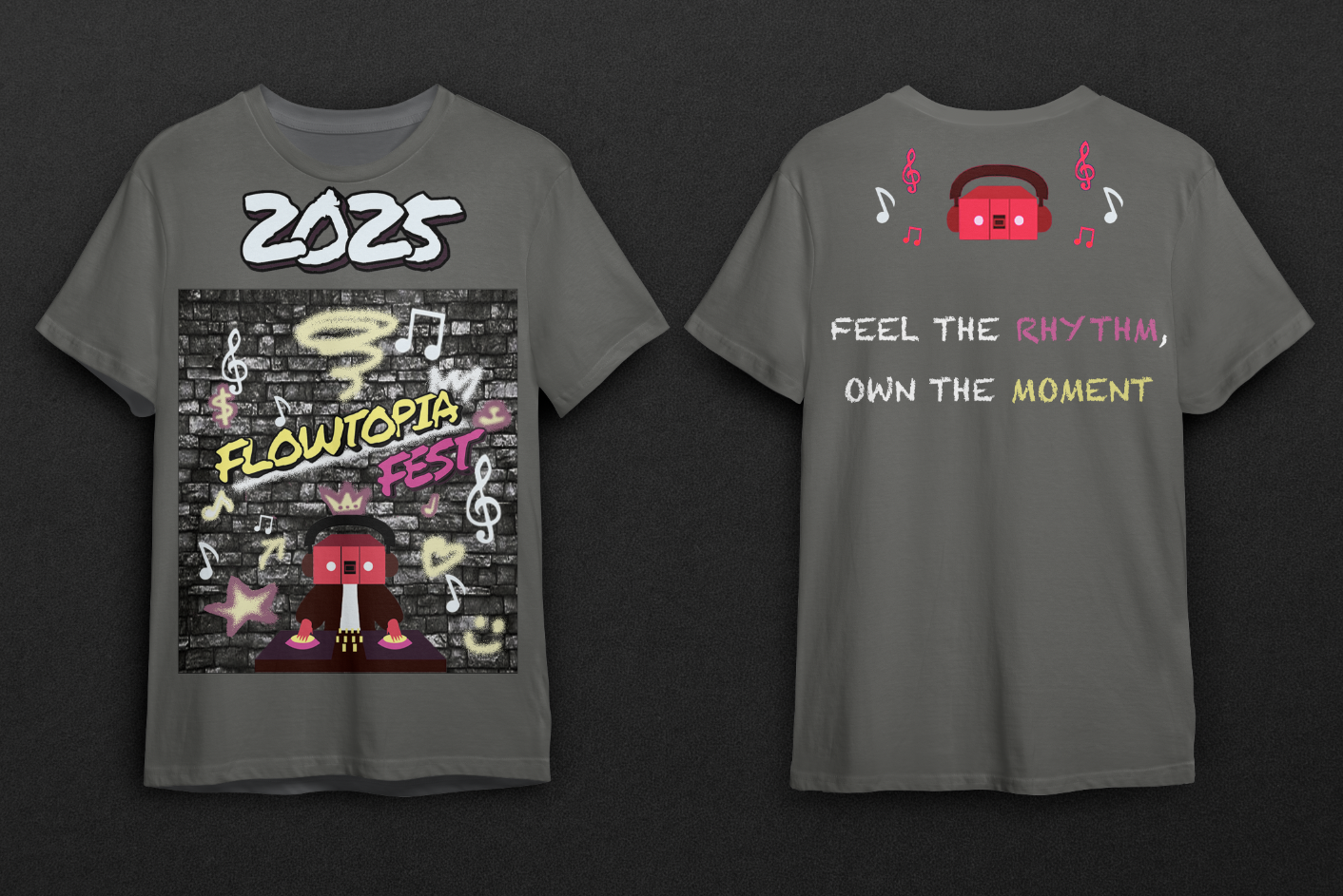
T shirt
The T shirt was inspired by what I did for the ticket but I didn't want them having identical designs. Instead, I added white music notes all throughout the brick wall rather than using organized red and yellow music notes. Additionally, there were four rows of three different colored music notes for the design on the back to prevent the shirt from seeming bland and simple.
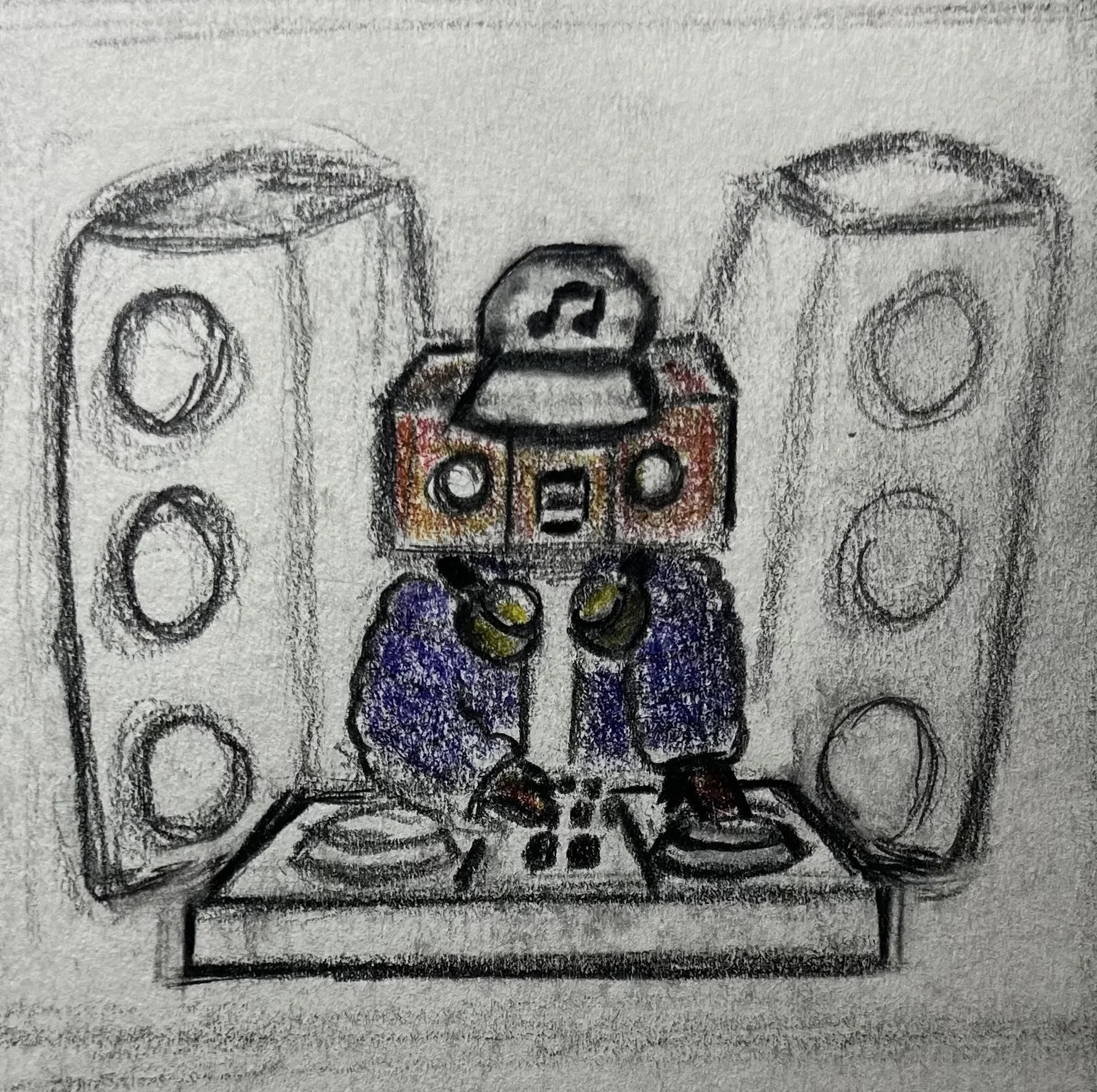
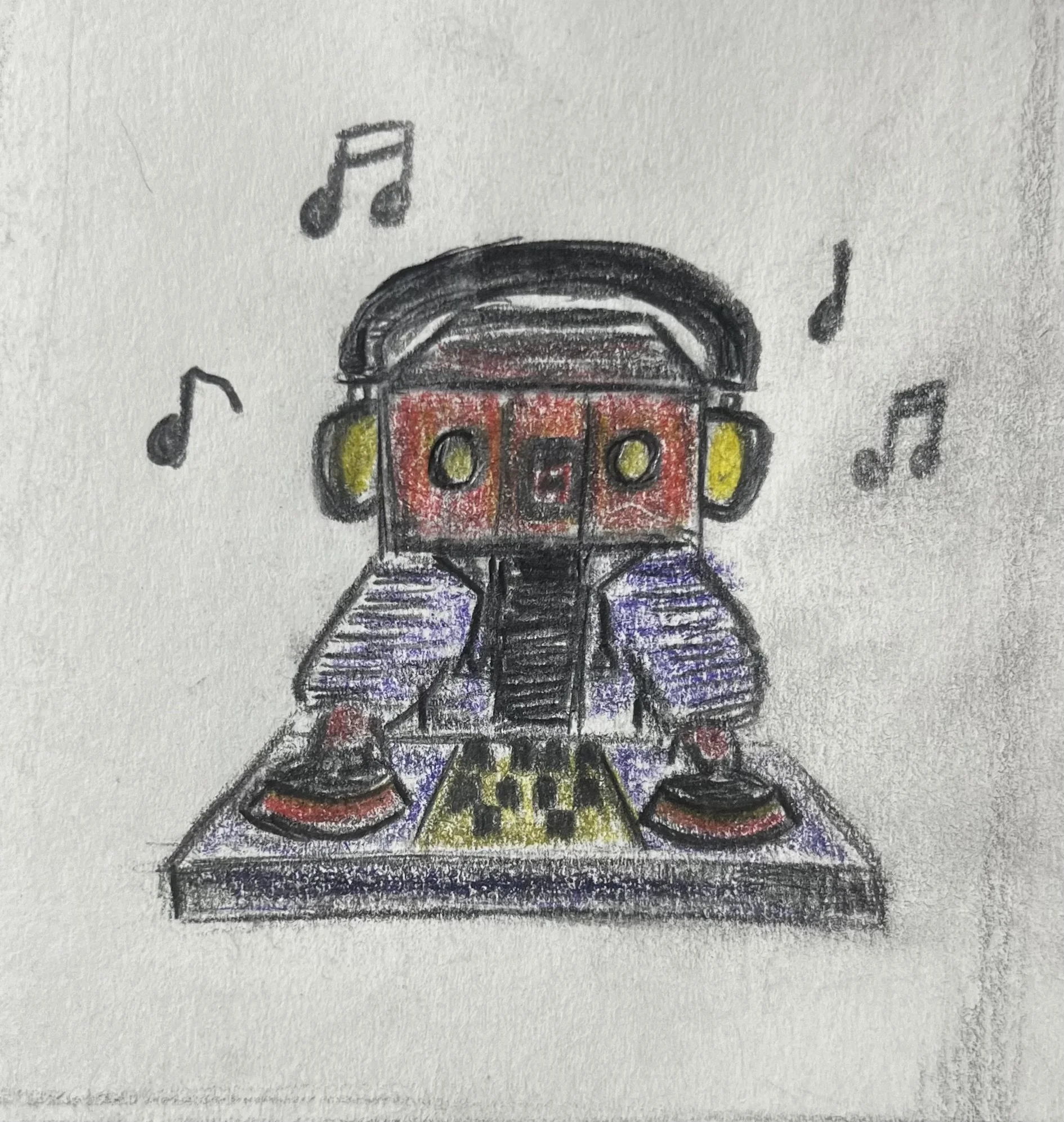
sketches
My sketches were inspired by the history of hip hop and by the idea of a DJ controlling the crowd. I wanted to emphasize music for this event since it was the focal point of festival so I knew the logo would lean heavily on that.
Logo Variations
The logos were inspired by hip hop culture and the idea of having a boombox for a head from Subway Surfers boombot character. I felt as though having the boombox for a head further pushes the music idea and I feel like adding the headphones along with the DJ set worked well with it. I went with a couple different color variations but ultimately chose to go with the bright red, pink, yellow, and maroon for the final design.

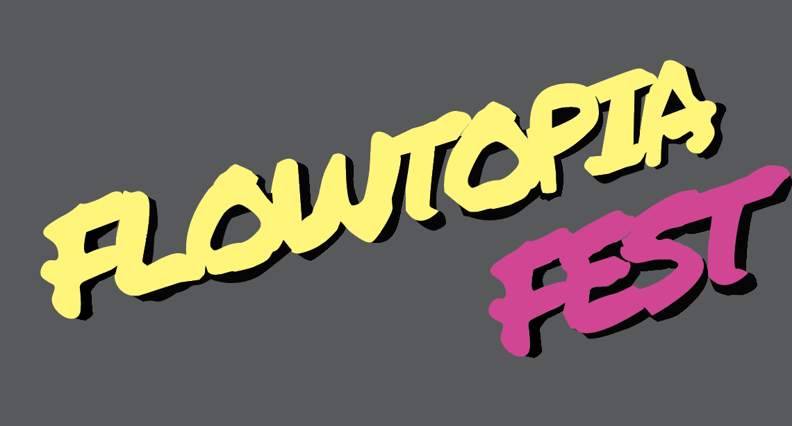
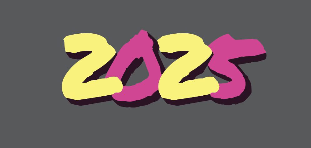
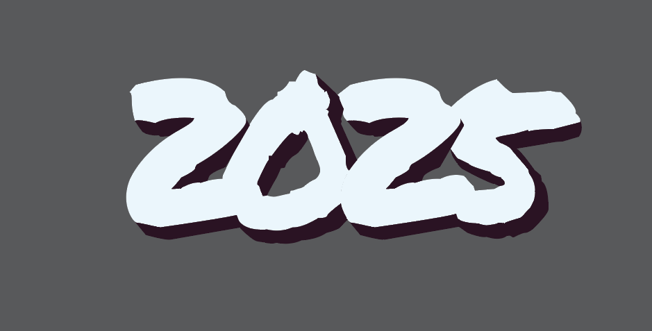
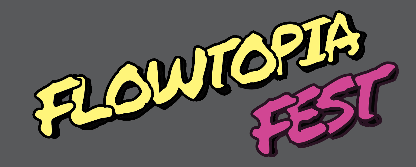
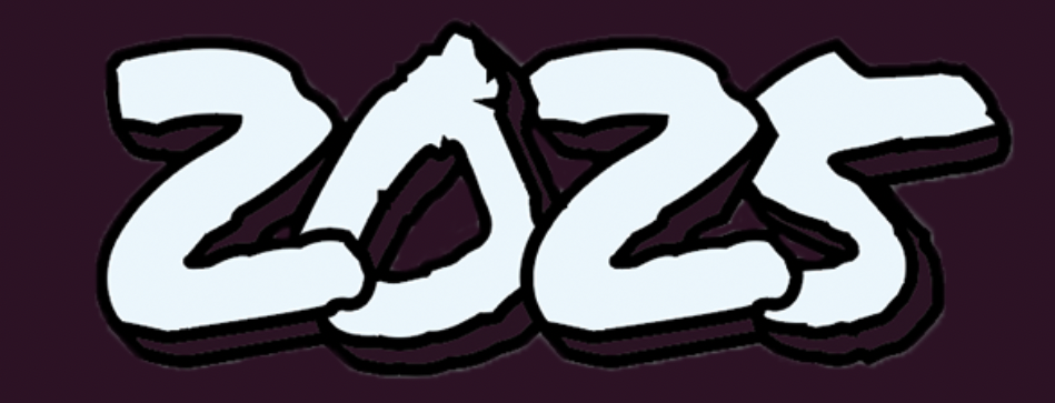
type variations
The type was inspired by hip hop culture and how graffiti art has stayed prevalent throughout hip hop's history. Having graffiti as the main type for the title along with the theme made sense to me, although it was pretty tedious assembling it initially. After I received feedback on it, I ended up changing the colors to simplify the bit of complexity the many colors had before and slightly tilting the title diagonally to help resonate more with typical hip hop typography.
Conclusion
I had a fun time creating this festival project, focusing on music and making it the centerpiece. The main challenge was keeping the shirt, tickets, poster, and other elements from looking too similar, avoiding redundancy. I did well designing the main titles and festival logo, as the graffiti type set the tone for a hip hop-inspired event, while the boombox character with headphones, a DJ set, and a hip hop outfit reinforced the theme. Overall, I’m satisfied with the final design and view it as a valuable learning experience for future projects.
Credits
Instructor: Paul Sherriff
School: Tyler School of Art and Architecture