
Ultiverse league
Created a sports brand identity for an All-Star event for an Ultimate Frisbee league. The deliverables include logos, custom typography, jerseys, custom items, apparel, poster, social media promotion, and advertisements.
Introduction
Ultimate Frisbee is a non-contact sport where 2 teams of 7 players compete on a field with a flying disc frisbee with the goal of catching the disc in the opposing team’s end zone. As stated by Zagoria (2015), it was originally invented in 1968 as an activity for high school nights by a Student Council in Columbia High School located in Maplewood, New Jersey. One of the main aspects of the sport that it relies on is the Spirit of the Game where it focuses on placing responsibility for fair play on every player to maintain the joy of the game. Based on research from the World Flying Disc Federation, the Spirit of the Game is where players in the sport practice thoughtful behavior both during the game and postgame in an effort to protect the fundamental joy of the game. This project was about the creation of a full brand identity for an Ultimate Frisbee League with All-Star game promotion. The project consisted of deliverables like logos, style guide, custom type, numbers, custom swag/apparel, social media promotion, and advertisements. Its visual identity was reflected in a hand-drawn illustration style to help add some flair to the advertising and helped create compelling, fun designs that align with the sport of Ultimate Frisbee and the Spirit of the Game. A sport driven by strategy, speed, and trust deserves a visual identity just as bold and spirited as the sport itself.
Problem
Creating a brand identity around Ultimate was worth pursuing because it is one of the many sports that gets overlooked by the more “popular” sports and gets limited coverage by the sports world. Although the sport’s popularity has shown steady growth throughout the years, sports like baseball, soccer, football, etc. overtake Ultimate in coverage and viewership in the US. According to the annual Topline Participation Report from the Sports and Fitness Industry Association (SFIA) from 2023, Ultimate has 2.1 million American viewership compared to sports like basketball and tennis where they both have over 20 million American viewership. The culmination of elements and athleticism is majorly underestimated as it combines numerous sports like football, soccer and basketball and yet, it still doesn’t have nearly as much exposure as it deserves. I believe that it would also be interesting to dive into an Ultimate Frisbee league for this project because I was able to learn more about the sport with how it operates and how it is advertised.
Style Guide
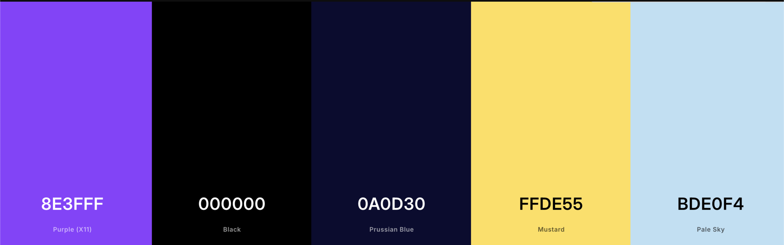
When deciding color, I wanted it to correlate with the name and logo with the outer space concept so I went with purple, black, a dark, navy blue color, yellow, and a sky, light blue. When observing many images of space, it contains a lot of dark colors like black and prussian blue because of how layered the infinite vacuum of space is. The incorporation of purple, yellow, and light blue are able to push this further since it implies a cosmic feeling while bringing in elements for spatial elements like the stars.
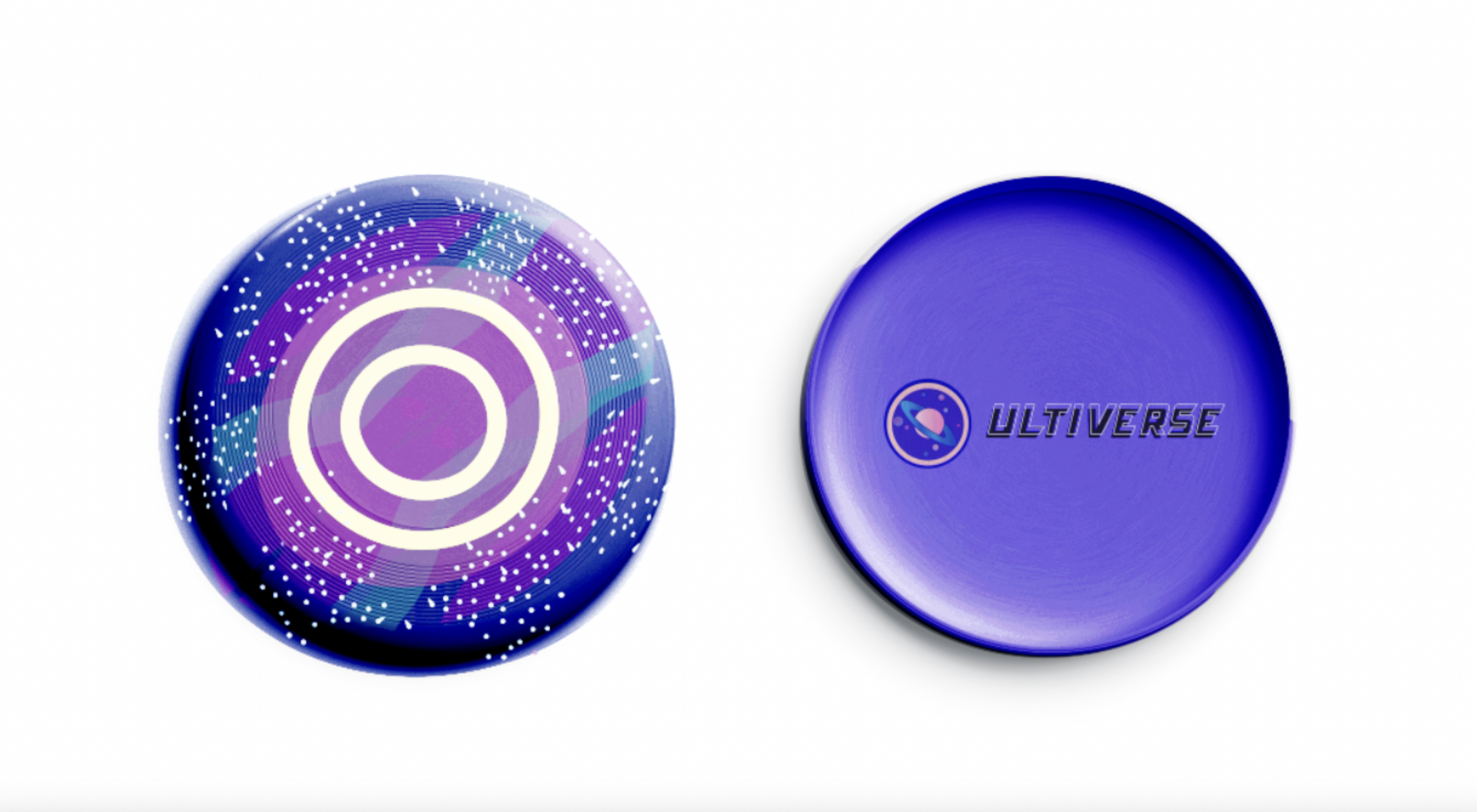
logos
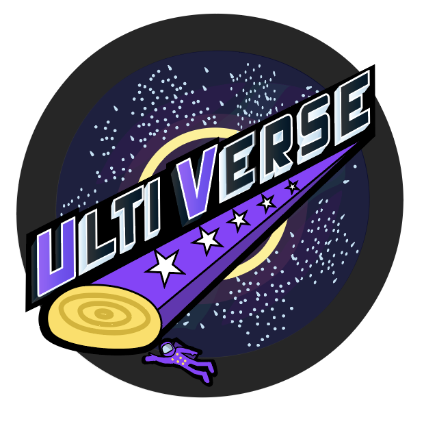
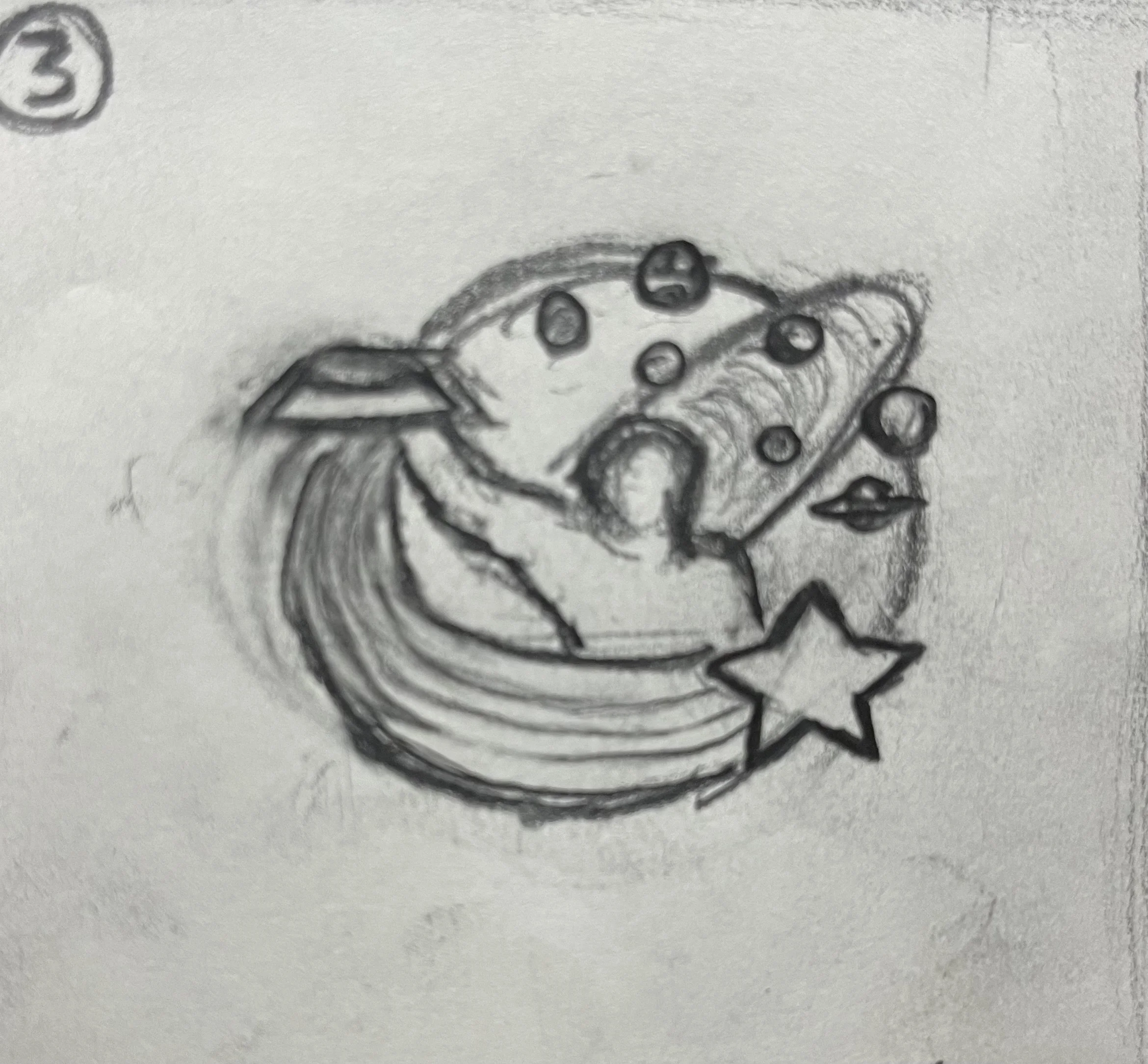
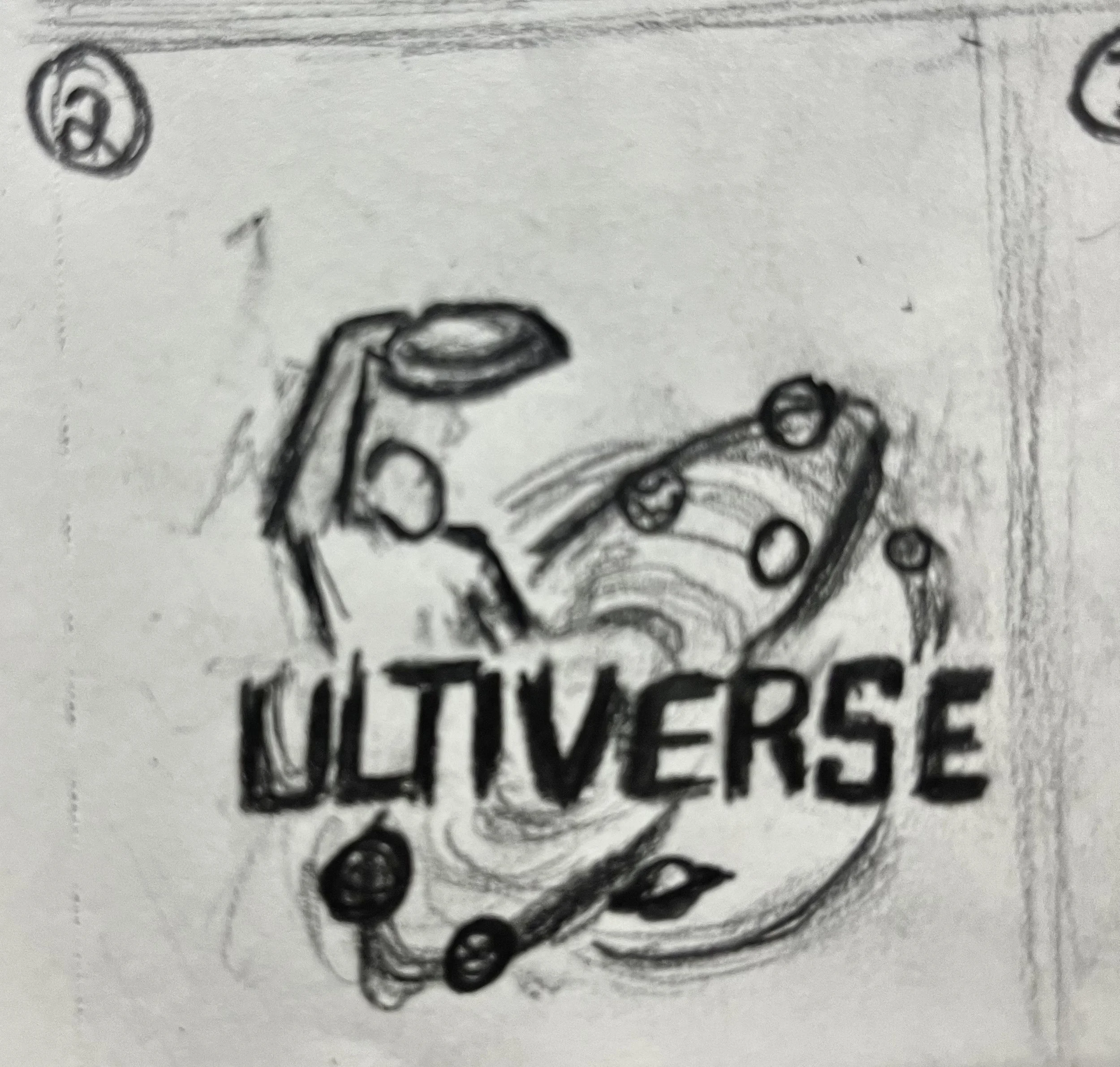
In my final developments of the UltiVerse brand, I wanted to fully connect a space aesthetic with the world of Ultimate Frisbee. It was essential to me to combine the two into one concept since the brand is an Ultimate Frisbee universe. When thinking about the word “universe,” I thought of elements like the vacuum of space, stars, the moon, planets, and other space phenomenons. Initially, I found myself feeling like I wasn’t able to capture that bold, sports feeling that I wanted while incorporating Ultimate into it seamlessly. With the logo in particular, the logo felt underdeveloped but after more research into the sport, other Ultimate leagues, and other sports leagues in general, I did more iterations of it until I felt like I successfully captured that feeling I wanted.
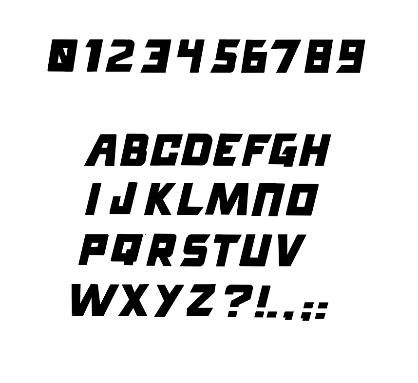
custom typography
I wanted to make custom typography to match the overall aesthetic of the brand and to coincide with the energetic movement in Ultimate Frisbee. For the custom type, I chose to make it bold to align with the type in the logo. The boldness, along with its slight skew on an angle and angular ends on specific letters and numbers, are meant to represent speed, energy, and a sense of fun to emulate that sports feeling and of a flying disc being thrown in the air. The italicization of the type was able to communicate that speed and energy displayed in the sport
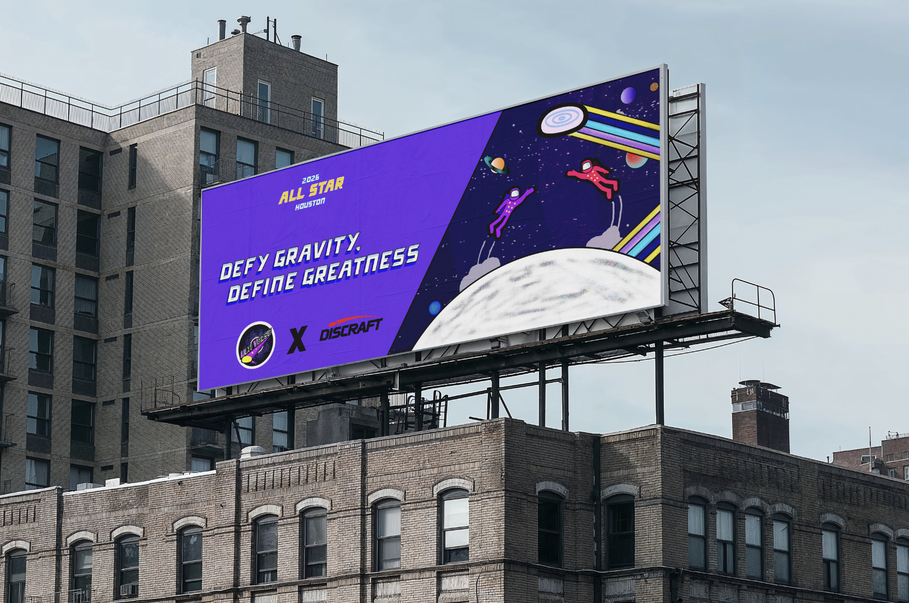
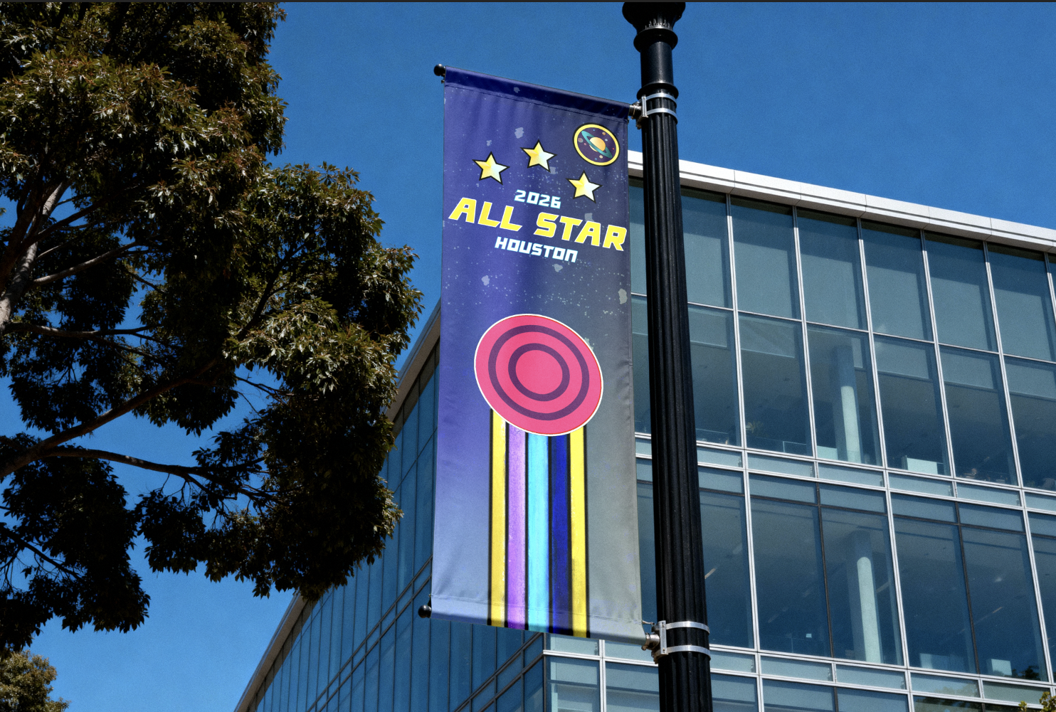
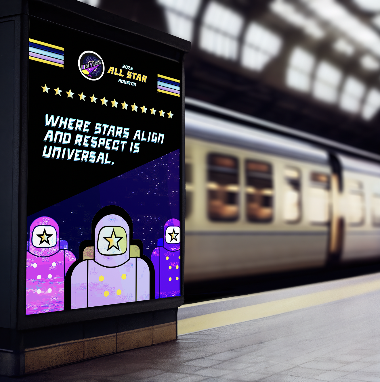
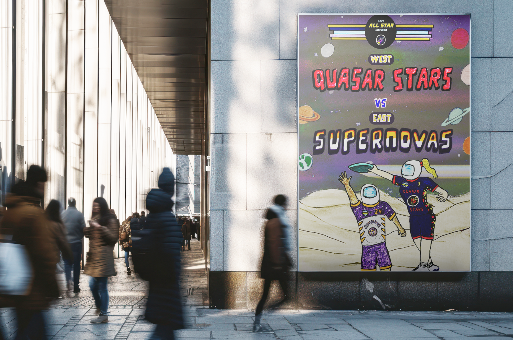
Advertisements
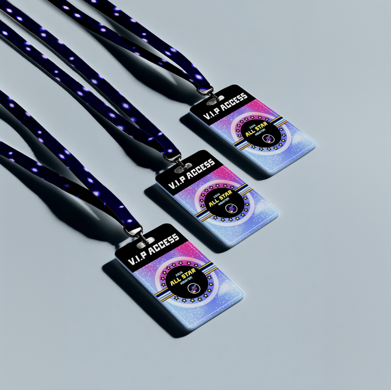
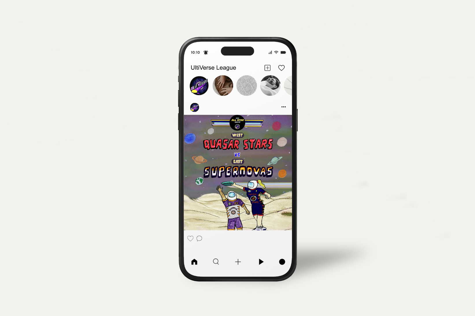
The final concept came easily once I dove into the world of Ultimate and had a clear understanding of what an appropriate brand would look like. The choice for the location of this event taking place in Houston comes from the idea of what states or countries comprises space stations. The advertisements were made to display high energy, the idea of an Ultimate Frisbee event defying gravity, and pull viewers to the All-Star event with compelling designs and clever taglines. The All-Star event V.I.P lanyards were meant to feel specialized with the cosmic, gradient aesthetic because the whole purpose of V.I.P access is to be able to receive privileged treatment throughout an event. The inclusion of the frisbee disc and the astronauts further push this idea as they illustrate the game being played and are one of the more important ideas of the concept.

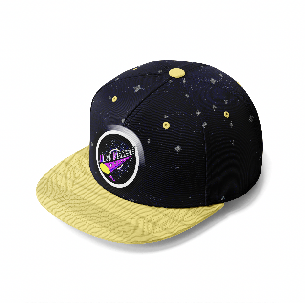
custom items
The merchandise and apparel were made to entice the audience to want to buy the product and look into the Ultimate league. Along with this, I pulled elements from the logo and remixed them to make them visually more appealing. This is shown through its vibrant colors, its illustrative touch, and subtle pattern.
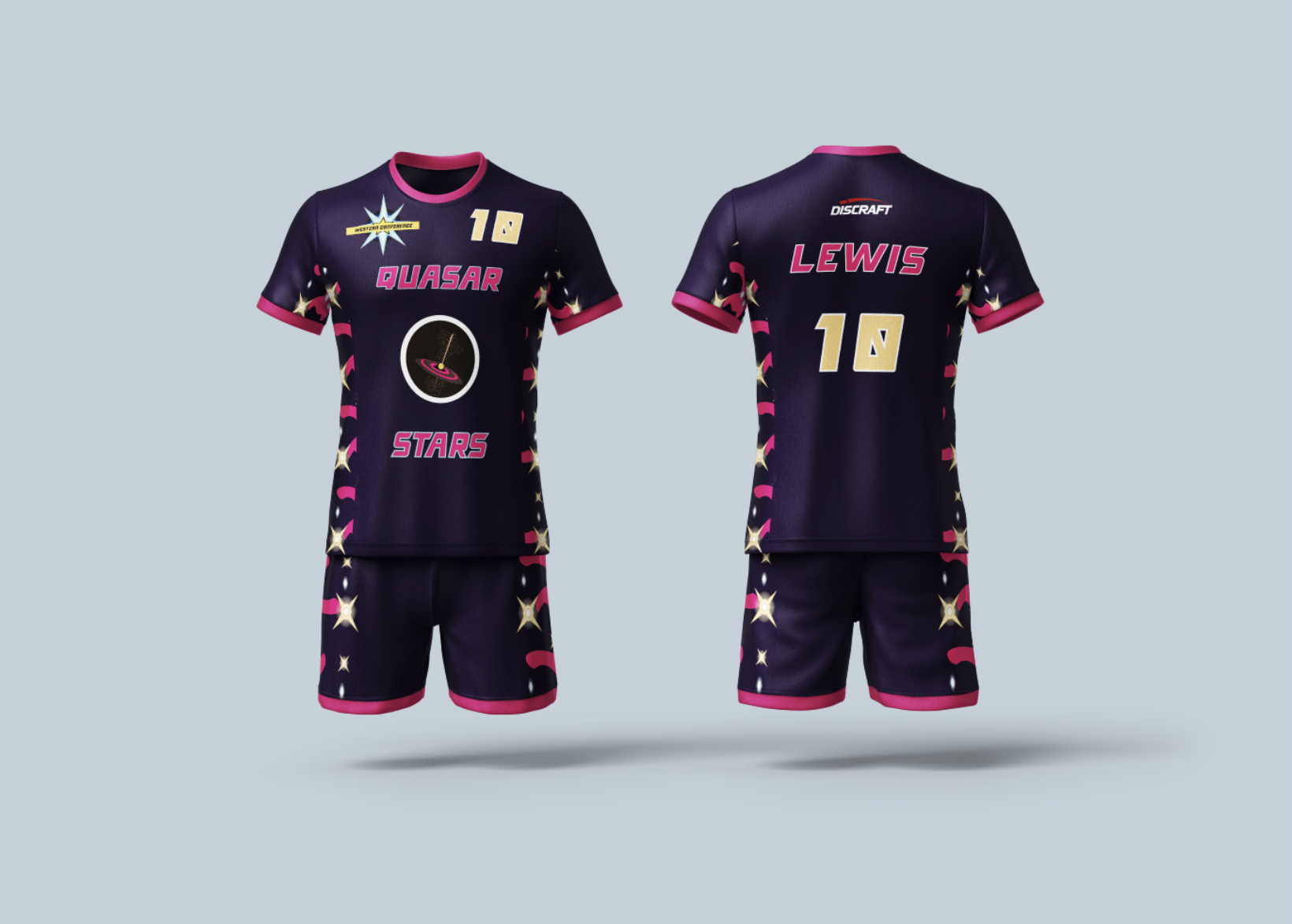
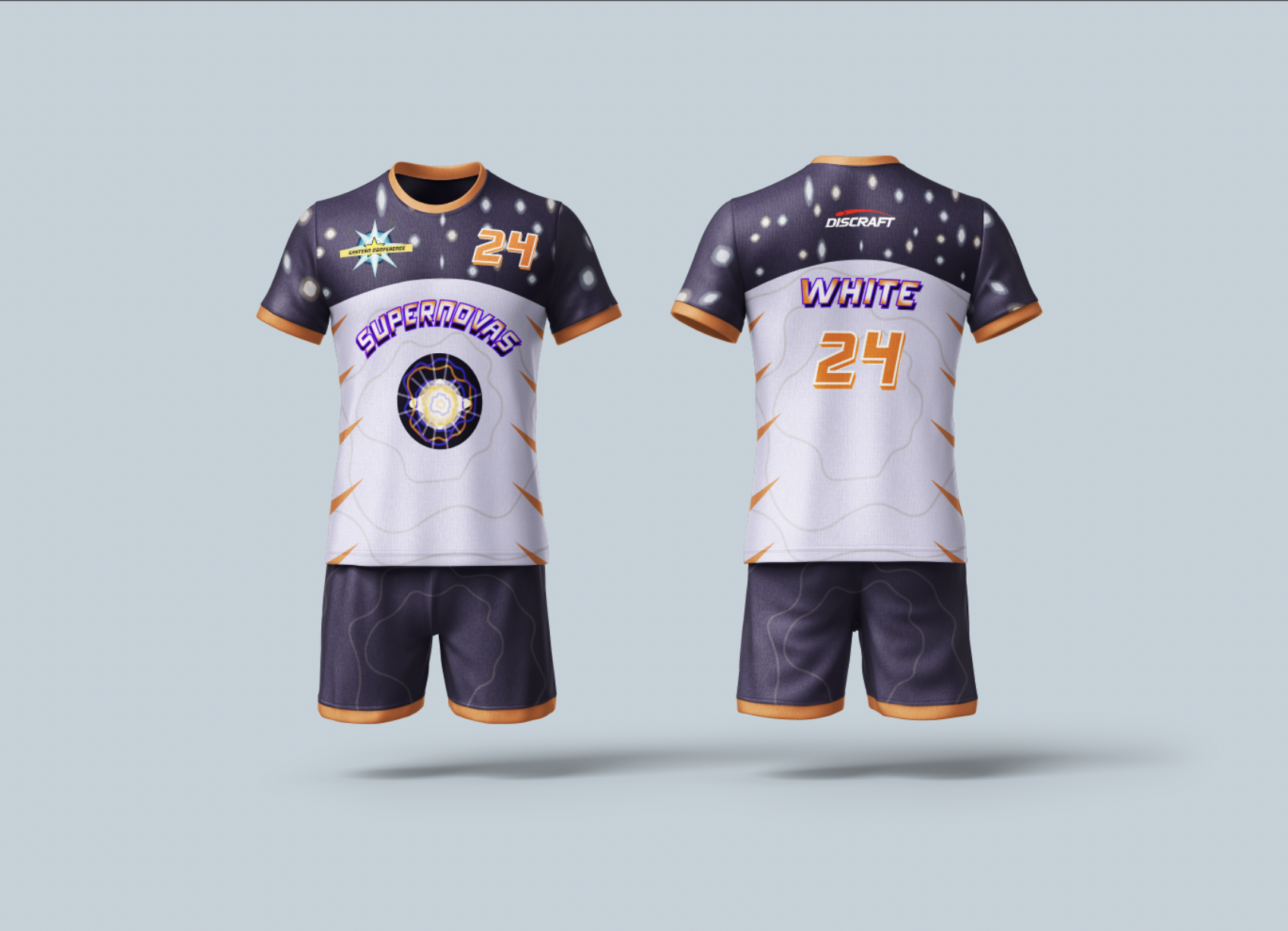
All-star Jerseys
The jerseys and the 2 All-Star teams were meant to tie into the space theme as the names are both spatial elements or phenomenons. The Western Conference team, called the Quasar Stars, and the Eastern Conference team, the Supernovas, were chosen to make the All-Star teams stand out from the typical East versus West formats and its aesthetics were meant to both grab the attention of fans of the sport and emulate each spatial phenomenon.
social media and poster promotion
With the social media and poster promotion, I wanted to add a more illustrative feeling similar to other visual designs done both under a professional team or fan art promotion for a professional team on social media. These two advertising promotions were meant to be the deliverables that primarily showcased my illustration skills and how I was able to apply them into this UltiVerse world.
process
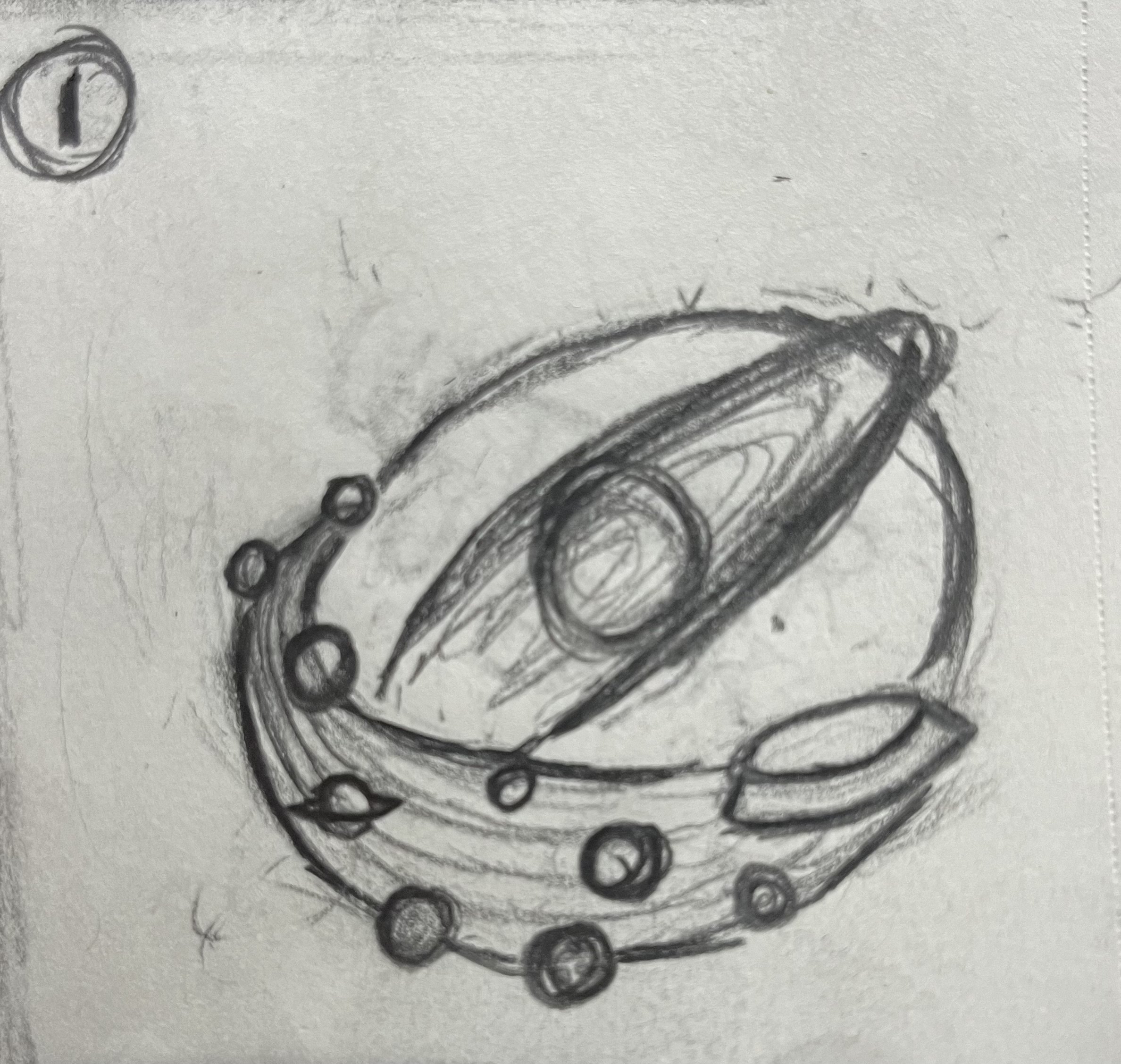
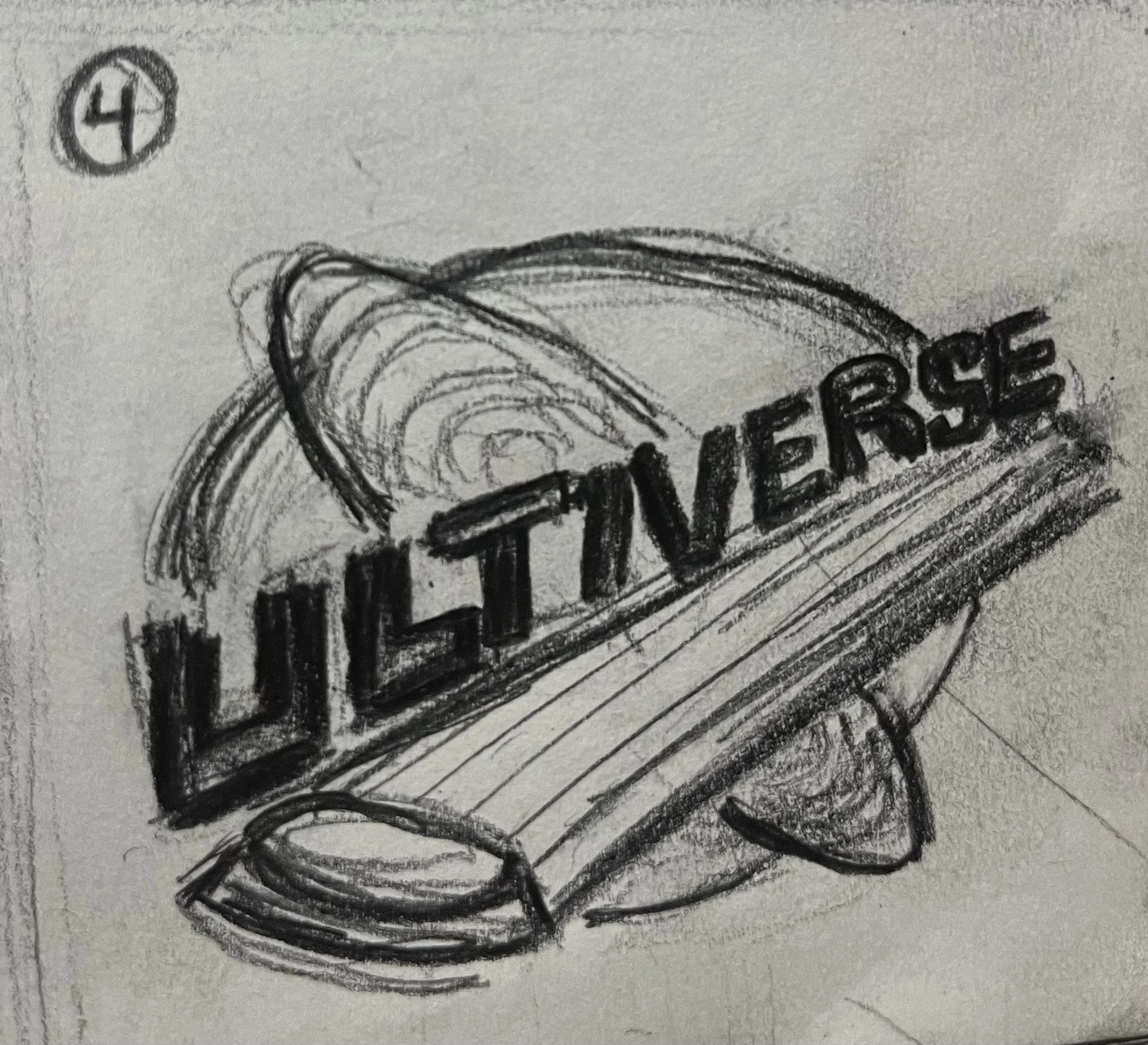
I began sketching concepts around the sport for potential logo ideas and thought of names to feed off of. I wanted the logo to be more than just a flying disc or a silhouette of a person with a disc so I found it challenging to find a way to make it unique and fun. Additionally, the other names that I came up with seemed pretty generic as names like the National Ultimate League, Ultimate Frisbee League, Disk Ultimate, and Project Disc weren’t able to fully grab my attention. As a result, I ended up choosing the name UltiVerse for the league name and made concepts where I had the name of the league surrounded by an outer space atmosphere with stars and solar system. The name came from the idea of having an Ultimate Frisbee universe where a league could be built off of that foundation and the potential world building that I could do based on that. When thinking of a universe, I instantly thought about outer space and the infinite amount of elements that it consists of, like the different galaxies, stars, and planets for instance. With that in mind, I was able to figure out how to build a world within this concept. From there, I expanded on the design by working on the type and depth of the logo.
reflection
I had a great time developing the brand for the Ultimate league, pushing myself to build a compelling space-themed concept while showcasing a range of skills and the sport as a whole. The advertisements were especially successful—they bring together type, logos, and layered visuals to create depth and a strong final product.
My goal was to challenge myself with another sports branding project, though I initially struggled to make the league stand out from others in its overall feel and world-building. Through repetition and research, I was able to overcome that. This process reinforced how important deep research is, both before and during design, and it’s something I’ll carry into future work.
Overall, this project shows clear growth in my problem-solving despite challenges along the way. I’m proud of how the lanyards capture a V.I.P. feel, how the jerseys turned out, and how I translated other deliverables into the poster and social media illustrations. Most of all, I’m proud that the project feels cohesive and complete.
credits
Instructor: Nathan Young
Project Type: Thesis Project for Graphic Design
Focus Areas: Branding, illustration, and sports branding design
Tools Used: Adobe Illustrator and Adobe Photoshop
sources
Mathison, D. (2024, March 1). Ultimate Frisbee Alumni & Hall of Fame: Pickleball #FTW. Facebook. https://www.facebook.com/groups/364928930277026/posts/6521021668001024/
Zagoria, Adam. “Ultimate.” What Is Ultimate, Jess Benson, 23 June 2015, www.whatisultimate.com/.
Discraft. (n.d.). Ultimate. World Flying Disc Federation. https://wfdf.sport/disciplines/ultimate/