
Bear Boost Brand
Created an energy drink brand that consisted of deliverables like a logo, typographic system, photo treatments, design elements, and a series of product mockup images.
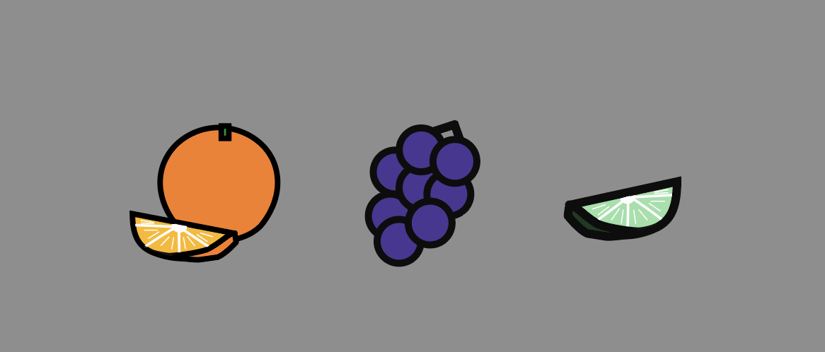
components
My components consisted of the grape, orange, and lime flavors. I made these designs on Illustrator to pair with the logo for the final energy drink design.
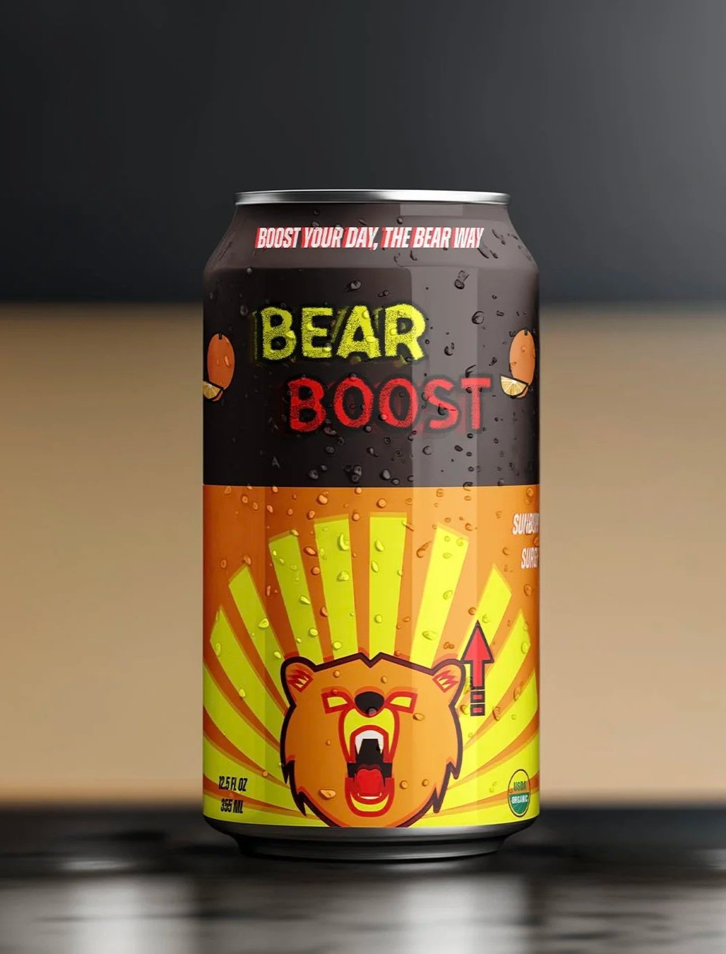
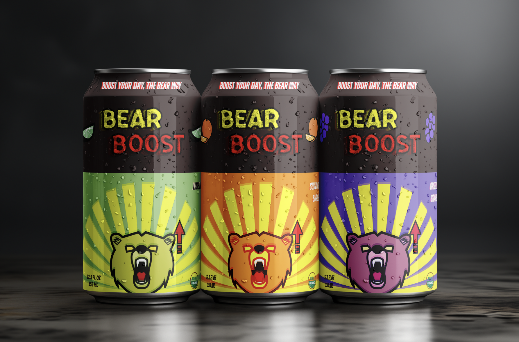
Product mockups
My final design was edited on Photoshop to add the additional overlay effects of the logo and type. I believe this effect was successful in the sense that it feels jittery as if the energy drink would make you physically shake from feeling so energetic. In addition to this, I added the flavor names, flavor icons, copy line, labels, and the measurement units to add more information for the consumer.
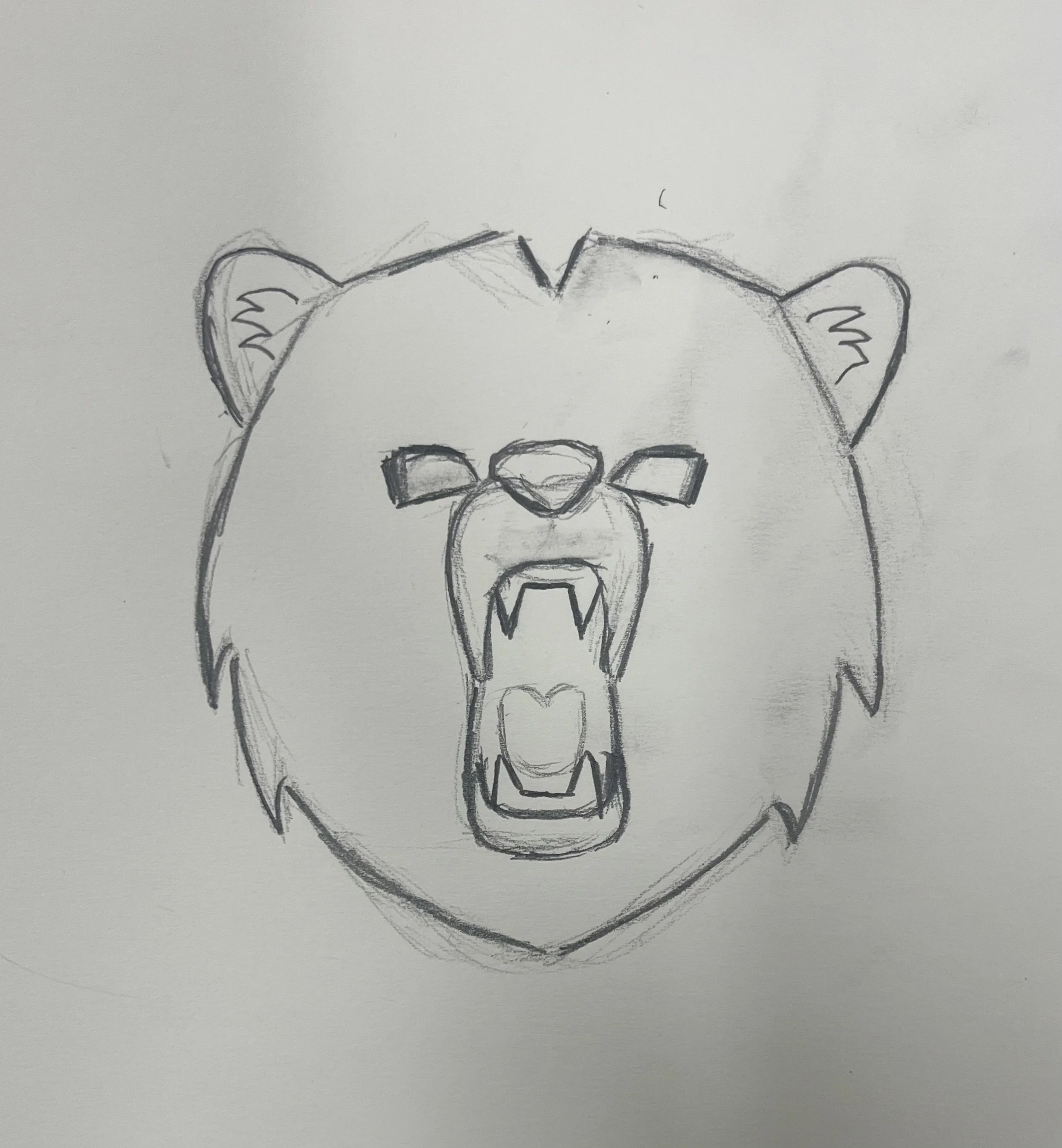
Original sketch
My original sketch was inspired by my idea of what I wanted my project to represent. After choosing the energy drink concept, I started researching where energy drinks were popular at and saw that California was one of the more popular ones. I found out the California was known as the Bear Flag State so I chose to revolve my logo around a bear concept.
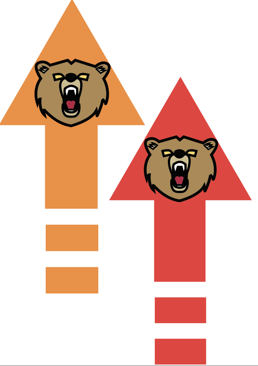
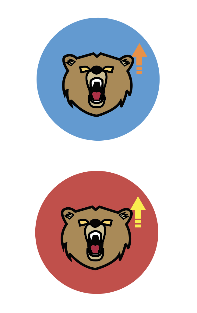
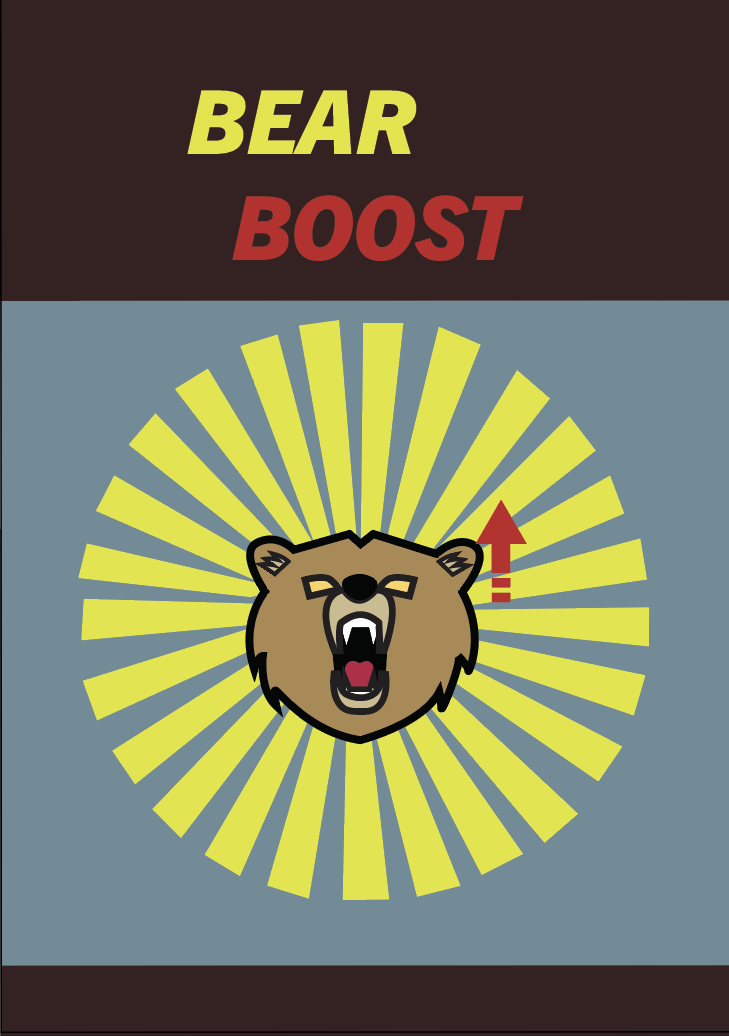
logo variations
For my logos, I chose to add the arrow as a booster icon indication to further emphasize the idea of gaining some kind of multiplier. The other bear logo concept with the sunburst was inspired as a way to bring in some California sun and to intensify the feeling of energy radiating from the bear. After hearing feedback from our critique, I chose the bear with the sunburst around it as it was the stronger concept to go with. From there, I made the logo a duplicate and added overlays to them to give us this jittery feeling of energy.
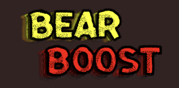
Type Variations
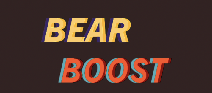
My type was inspired by the idea of finding a typeface that could give off a feeling of energy while also maintaining a wilderness kind of feel to it. After looking into the National Park posters, I was able to find a typeface that worked well with what I wanted to do for this project. I ended up choosing the Trade Gothic Next LT Pro Heavy Italics and added an duplicate overlay to add an effect where the type has movement. This effect pushes the effect in the logo as they also were made with duplicates and overlays.
Conclusion
Throughout this project, I had a fun experience designing my brand and felt that I was able to incorporate my style into the logo while creating an energetic feel. Looking back, I would rework a few choices, like changing the color of the “bear” in “Bear Boost” for more contrast or adding trees toward the bottom of the can. The biggest challenge was finding a font that conveyed both wilderness and energy, but using overlays and duplicates helped create a jittery effect that implies energy. The logo and brand direction came more easily after some research, and having the drink originate from California helped inspire the name “Bear Boost,” since California is the Bear Flag State and the alliteration worked well. Overall, I’m satisfied with how the final design turned out and would be interested in doing similar work in the future.
Credits
Instructor: Paul Sherriff
School: Tyler School of Art and Architecture