
Philly Eats Restaurant
Created a restaurant brand that included deliverables like a logo, type, menus, advertising, packaging, branding, and a Figma prototype for mobile app. I ended up going with a mobile restaurant called Philly Eats where they deliver various foods, drinks, and desserts originating from Philadelphia to their customers via the app.
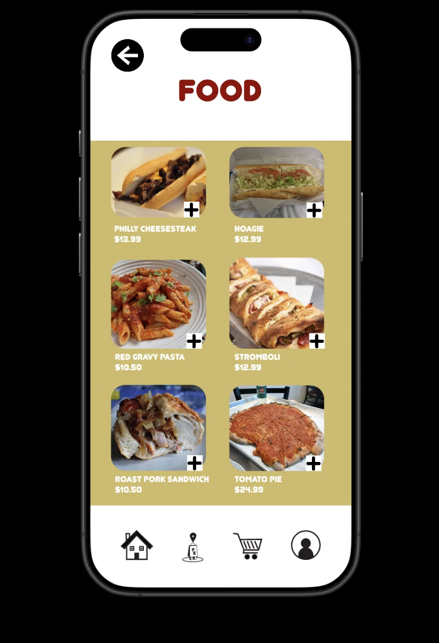
menus
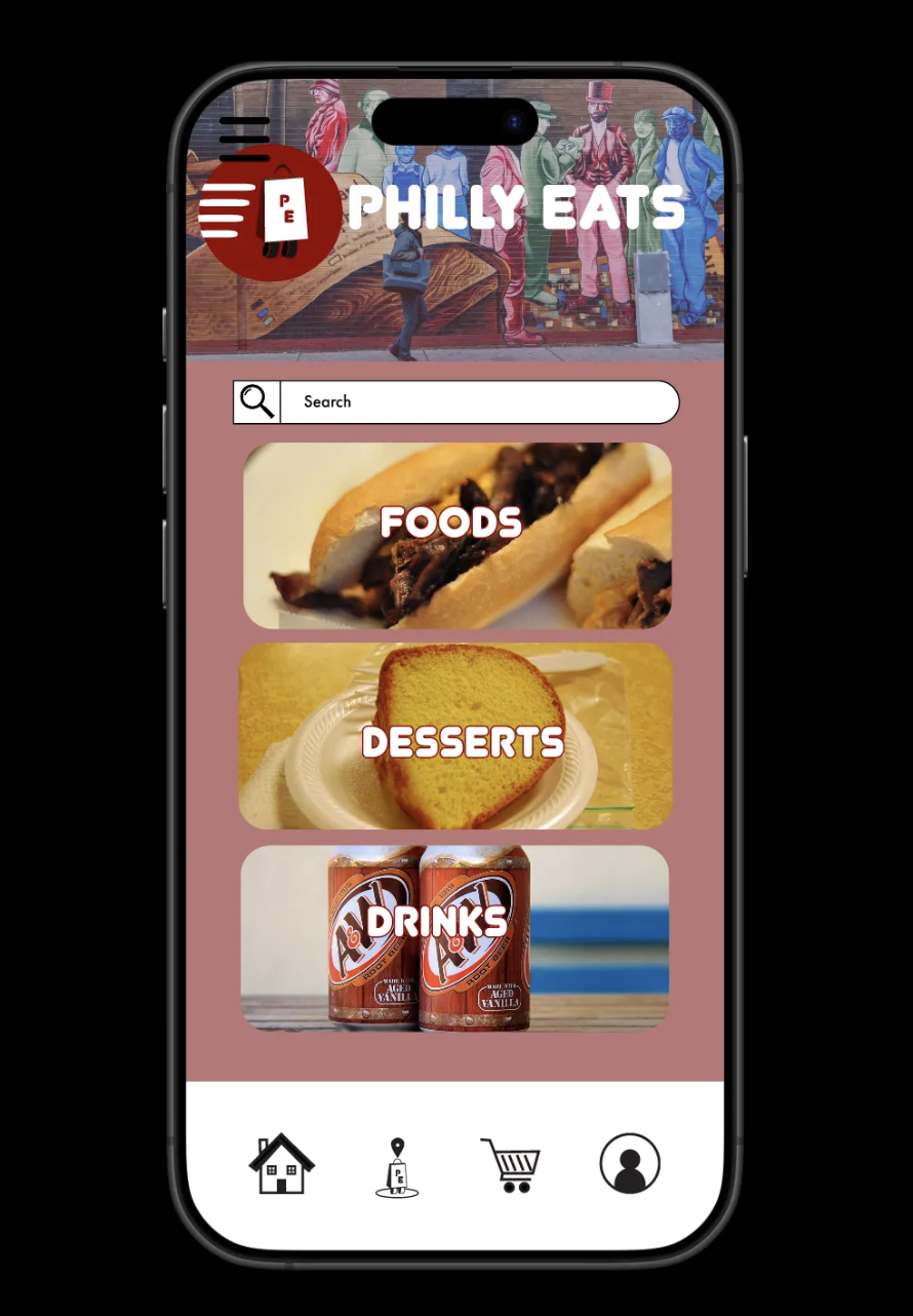
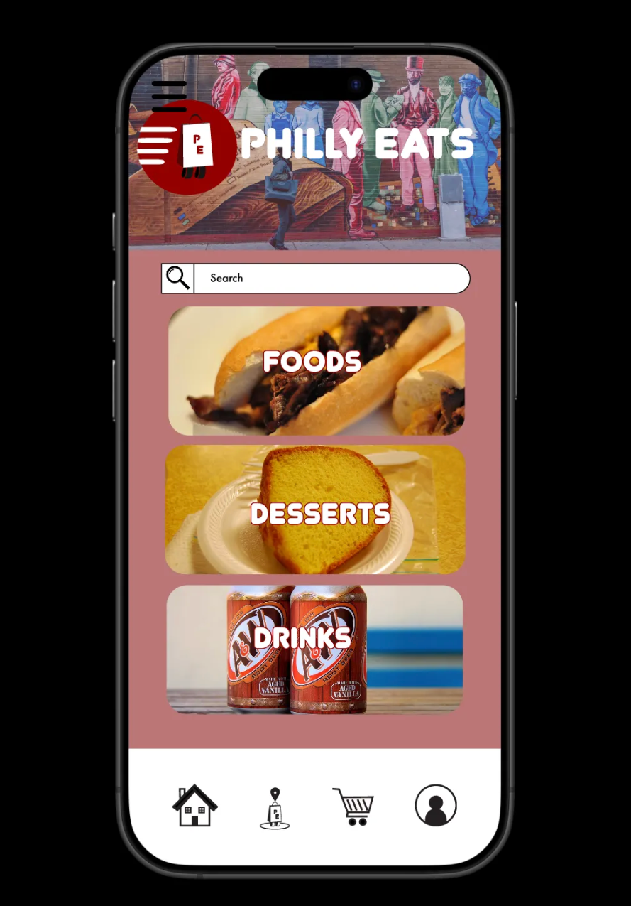
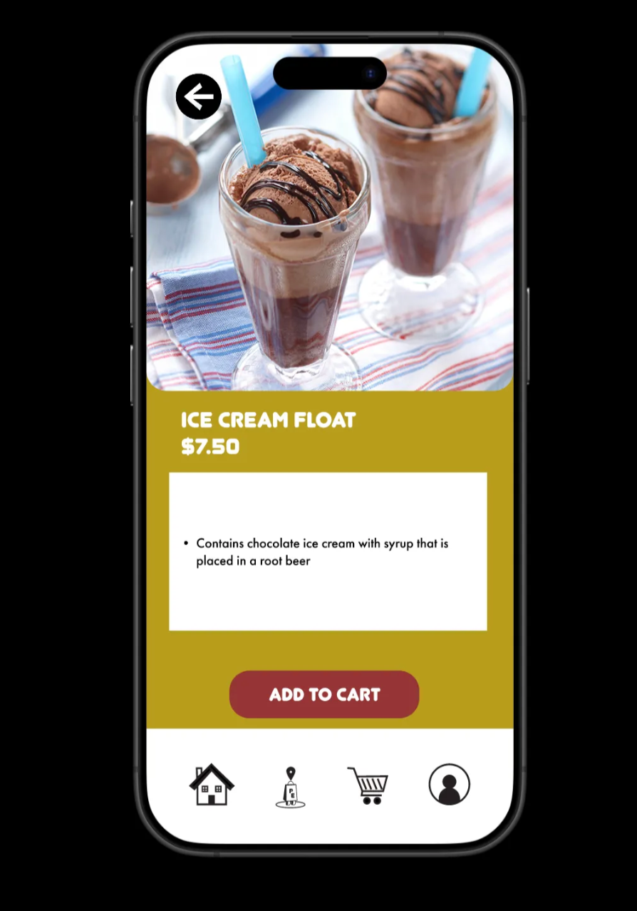
For my mobile delivery app, the menus are shown on the Home page where it gives you options between the foods, drinks, and desserts. Within each collection are its respective items in that category, gives you various choices to pick from, displays the prices and the name of the items, and gives you an idea what the item themselves look like. The user is able to maneuver from collection to collection and add other items fairly easily.
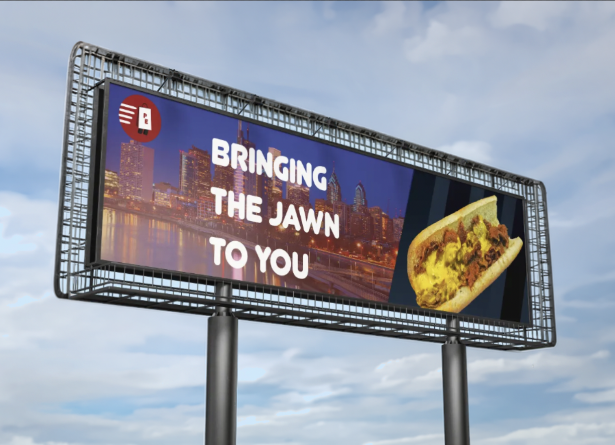
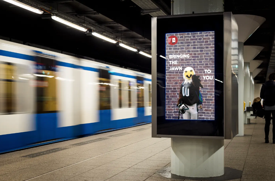
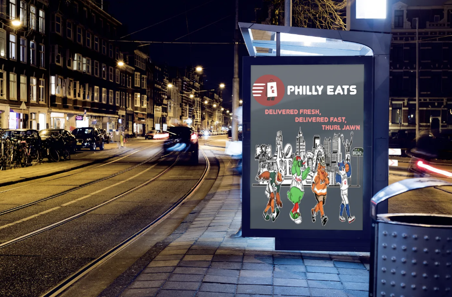
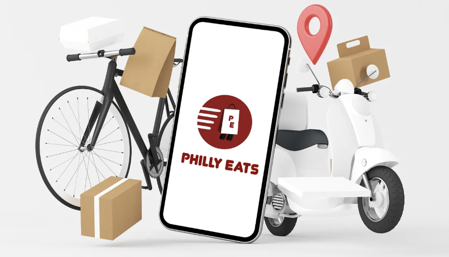
Advertisements
The advertising for this brand includes a billboard, subway poster, city terminal display, and social media ad. The billboard shows the Philadelphia skyline with a cheesesteak and the headline “Bringing the Jawn to You” to emphasize delivery. The subway poster features the Eagles mascot, Swoop, pointing at the viewer in front of a brick wall, using the same headline as a playful nod to Philadelphia terminology while also representing the city’s gritty character. The city terminal display shows the Eagles, Sixers, Flyers, and Phillies mascots walking through iconic Philadelphia locations with the headline “Delivered Fast, Delivered Fresh, Thurl Jawn,” highlighting the brand’s fun and friendly tone. The social media ad places the logo and brand name on a phone screen alongside bikes, delivery bags, and boxes to clearly show how Philly Eats operates as a delivery service.
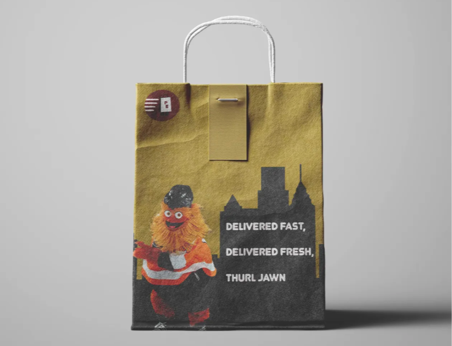
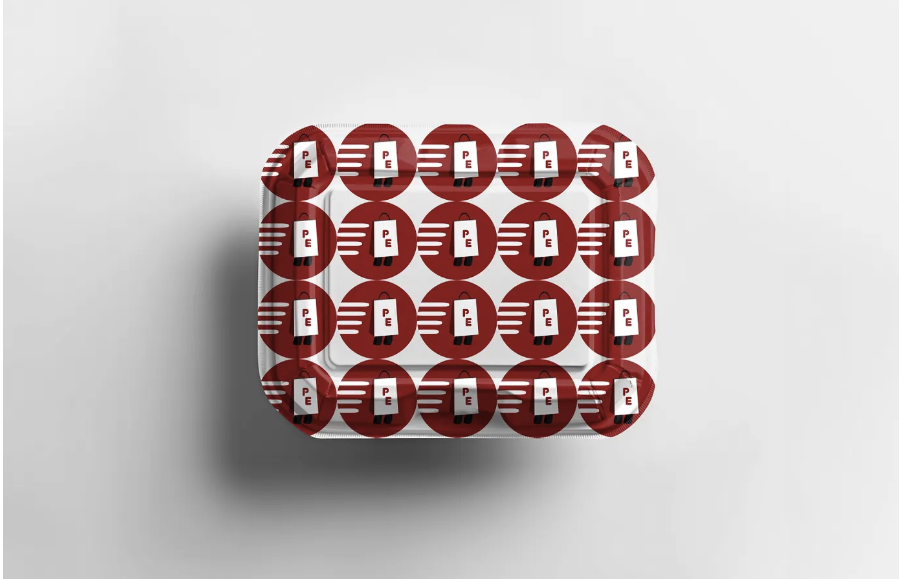
Packaging
The packaging for this brand contains a delivery bag and food container. The delivery bag shows the Flyers mascot, Gritty, in front of a silhouette of the city with headline saying, “Delivered Fast, Delivered Fresh, Thurl Jawn” as a way to resonate with the city and as a way to use well-known Philadelphia terms. The container has the app’s logo pattern all over it to show a simple, yet fun design.
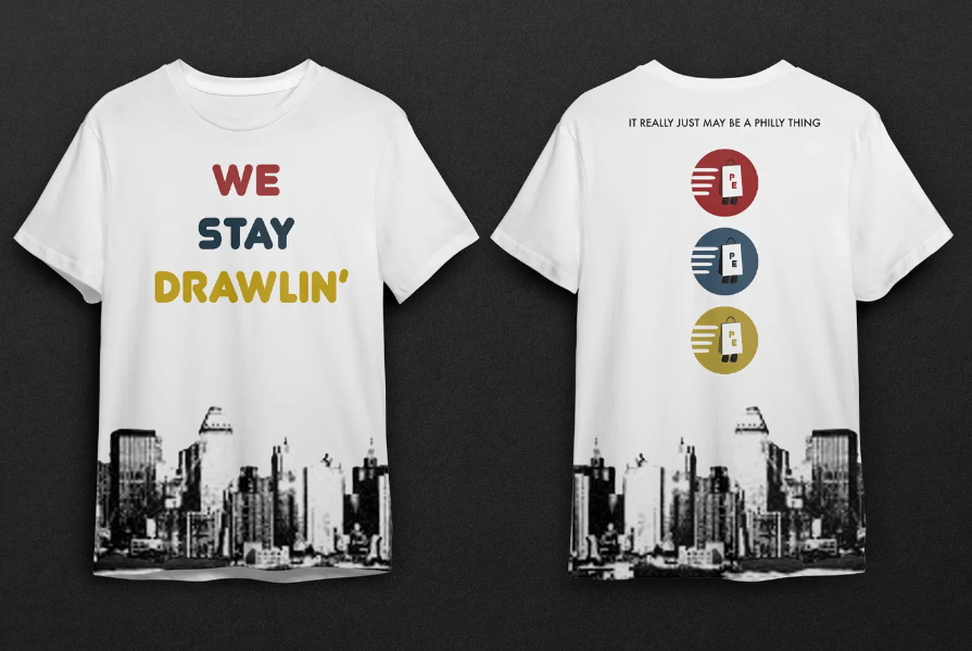
Collateral swag
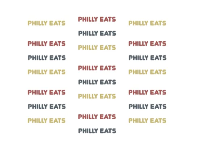
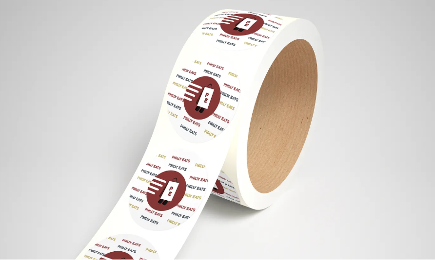
The collateral swag for the app includes a T-shirt and a sticker. The front of the T-shirt features the Philadelphia skyline at the bottom with the phrase “We Stay Drawlin” above it, connecting the design to local Philly slang and culture. The back displays the logo stacked vertically in its three main colors to represent the gritty color palette used throughout the brand, along with the phrase “It really may just be a Philly thing,” referencing the common saying in the city. The sticker design repeats the Philly Eats logo pattern in the background to reinforce the brand and showcase its color scheme.
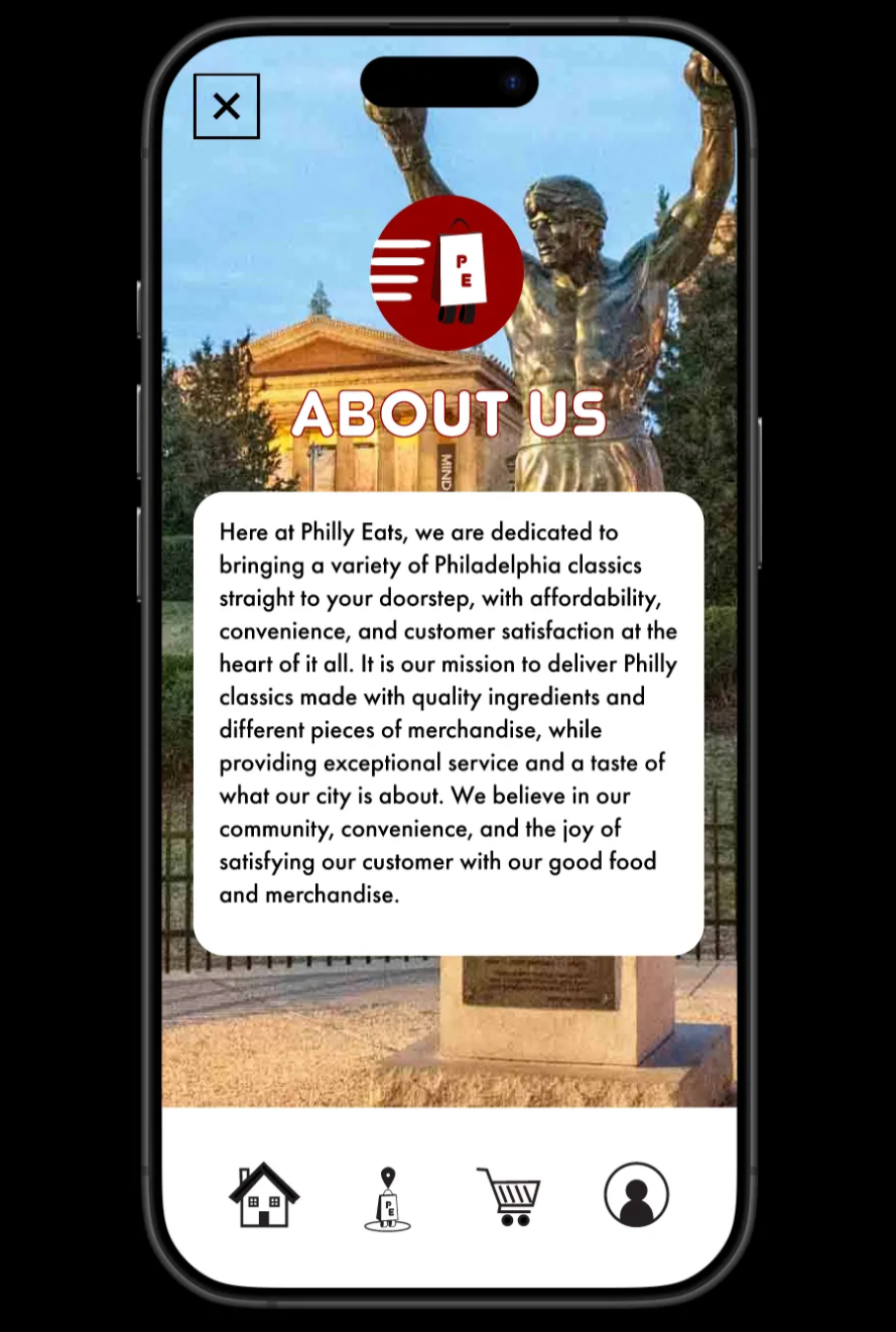
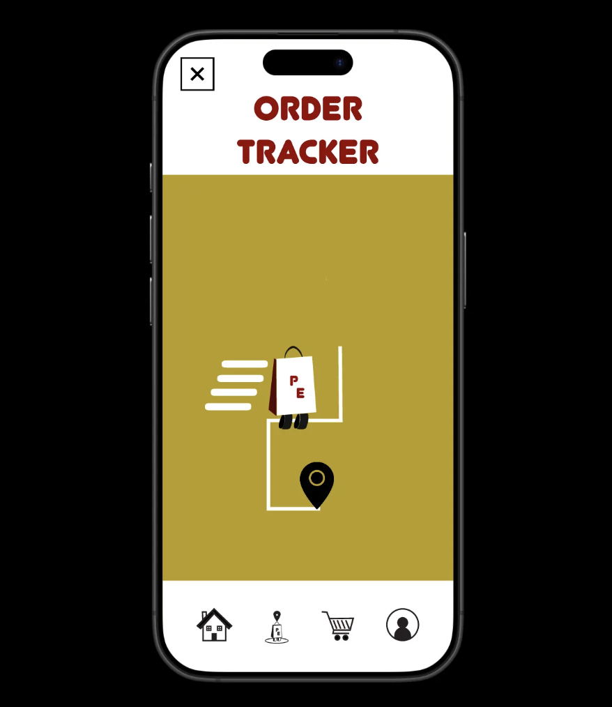
mobile app
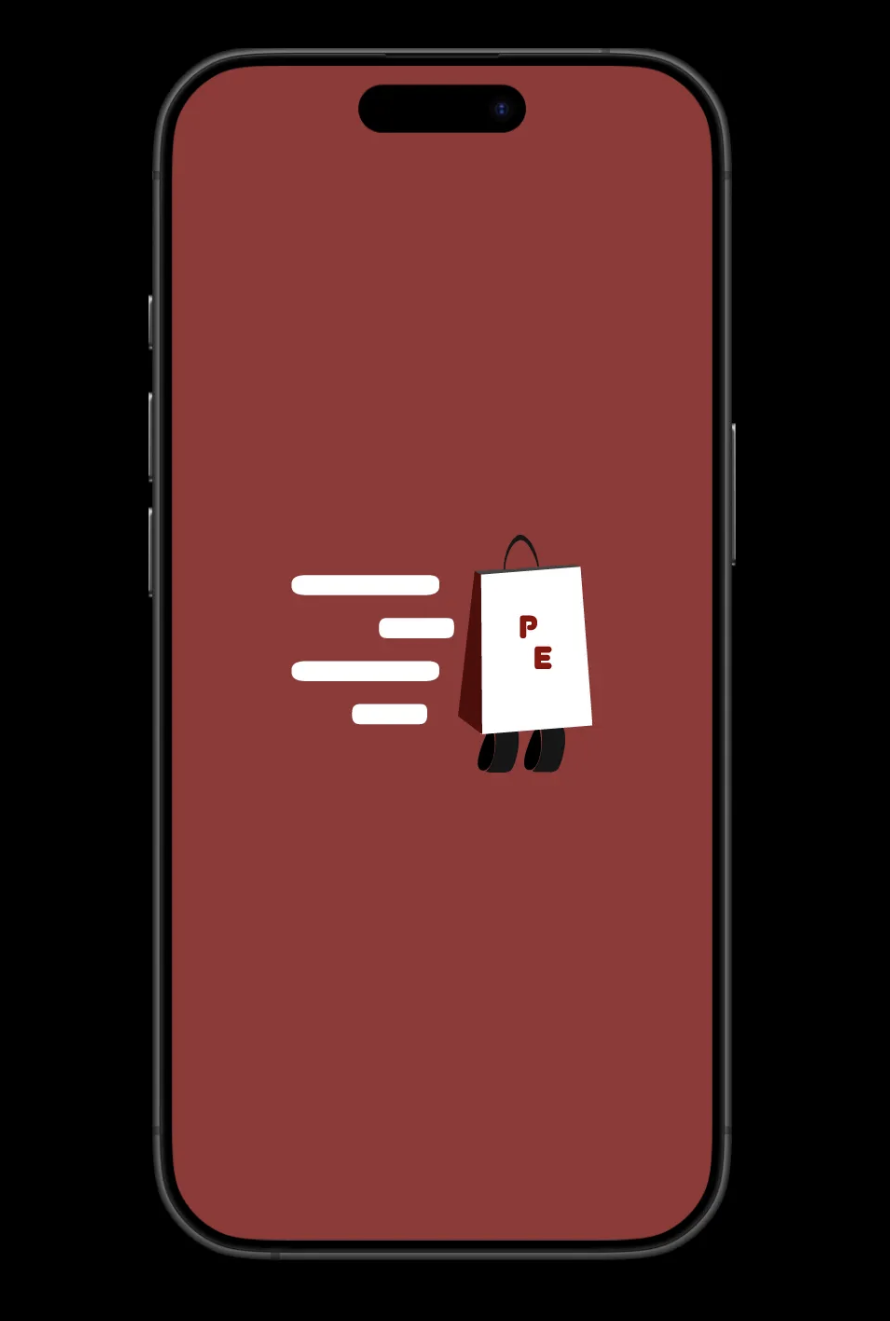
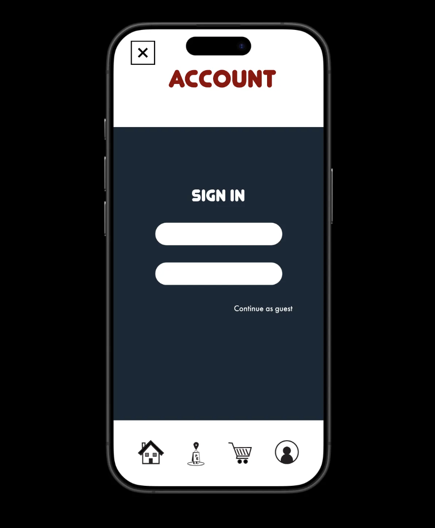
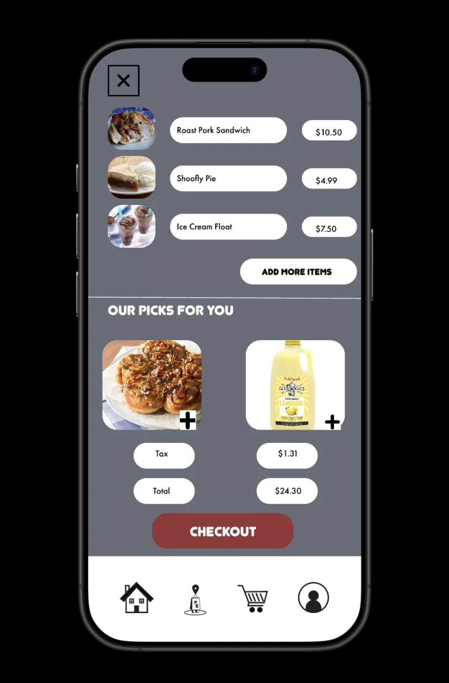
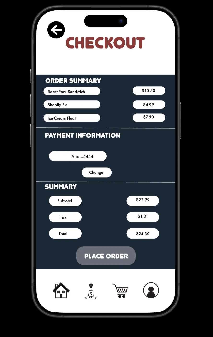
The Philly Eats mobile delivery app allows users to navigate through different options while ordering, including food, drinks, and desserts. It also includes additional pages such as About Us, Order Tracker, and an Account page where users can sign in or continue as a guest. The collection pages are a key part of the app, showing available items, their images, and prices. From there, users can view an item description page, add items to their cart, and proceed to the Checkout page, which summarizes the order, displays payment information, and allows them to complete their purchase. The app also includes micro animations in the loading screen, search bar, and order tracking page to add liveliness and reinforce the brand’s personality.
Video Walkthrough of app
Process
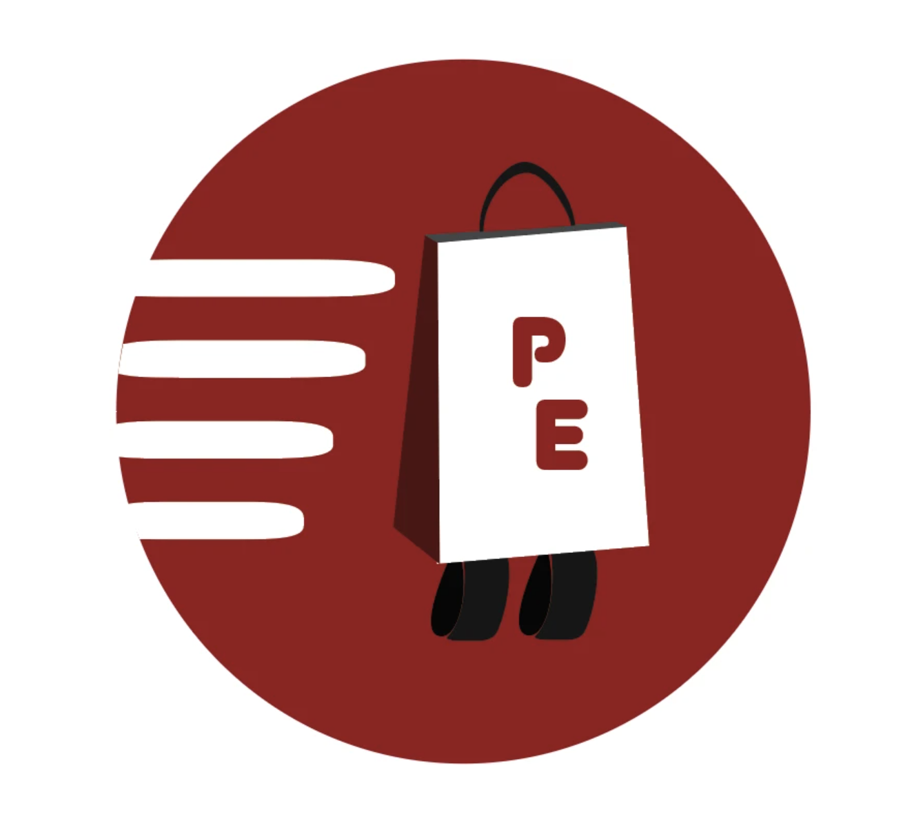
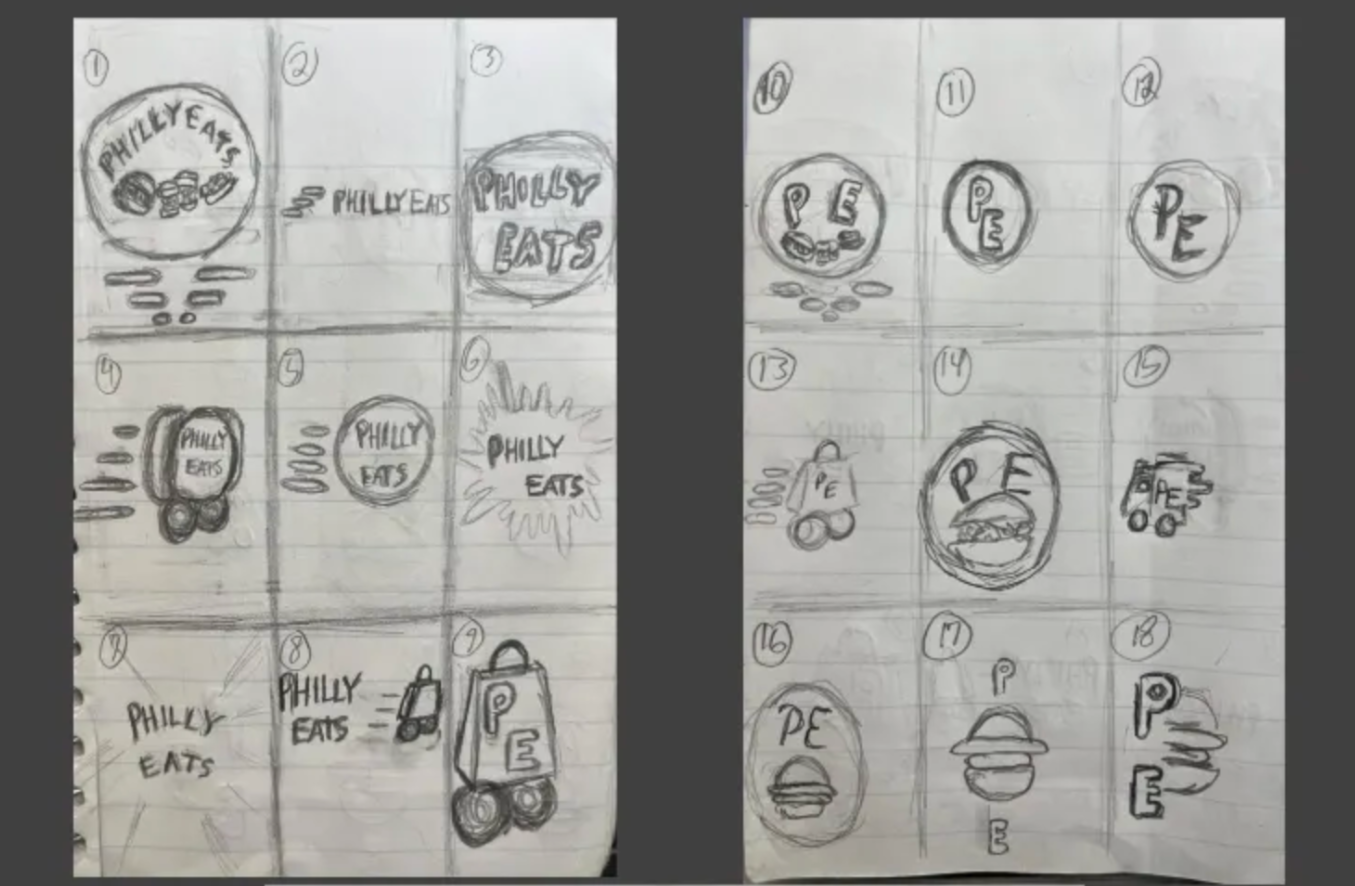
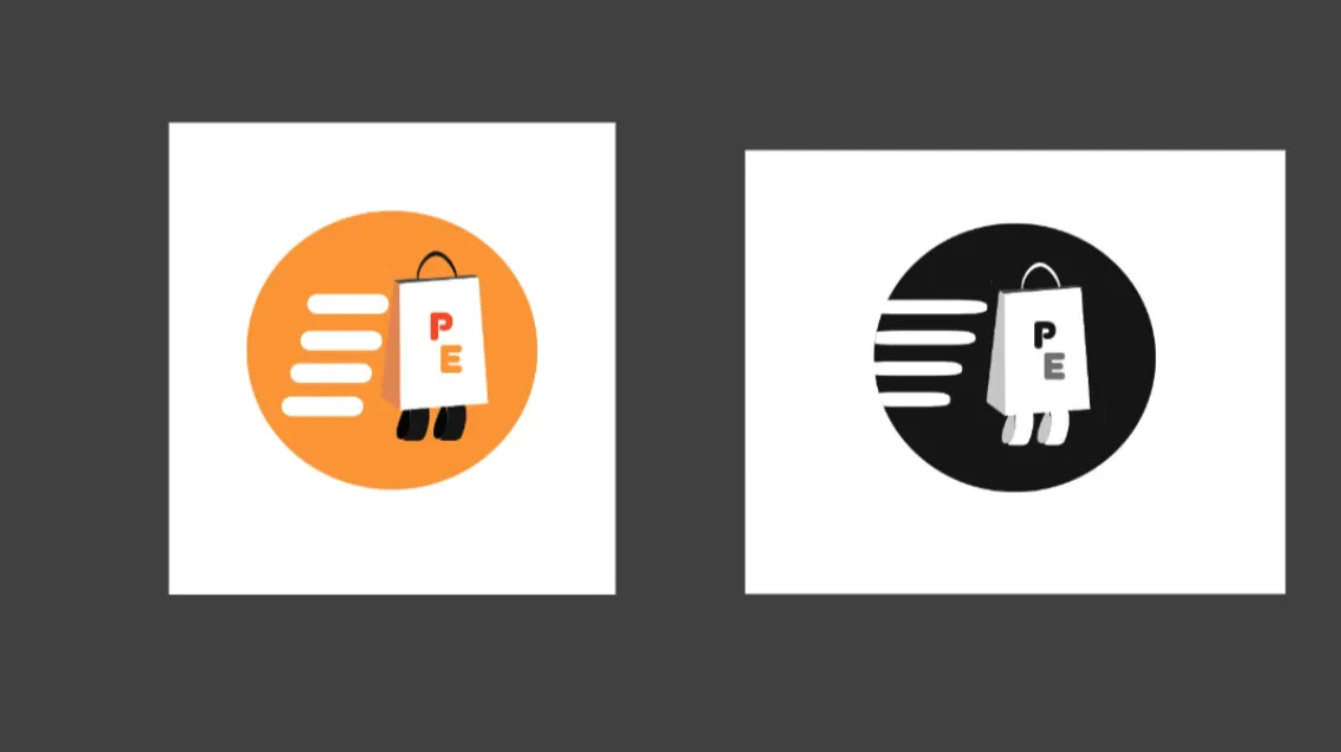
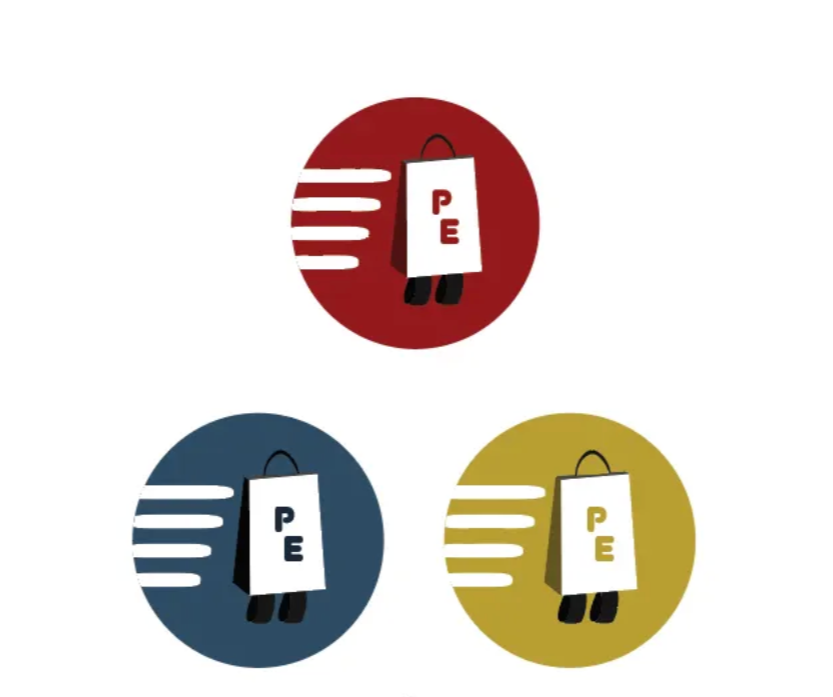
The inspiration for the colors of the logo was to implement a gritty color to represent a food delivery app that has food based in Philadelphia which is a city full of toughness. From there, I chose the secondary colors of a faded blue and a mustard yellow to better represent the city’s grittiness with a couple colors to contrast against and boost its grittiness. The Type was inspired by wanting to use a bubbly kind of font to show boldness while also being the bridge to welcoming people to visit and use the app. The logo itself was inspired by the delivery concept that resulted in showing a bag on wheels on the way to its destination. Additionally, the speed boost marks behind the shopping bag were meant to both indicate speed and resemble the boldness/curviness of the font.
Conclusion
Developing Philly Eats was an interesting experience. At times everything came together smoothly, while other times I felt stuck trying to find ways to improve the app. Despite that, I learned a lot, including how to apply animations in Figma, think creatively to solve design problems, and effectively advertise a product. The most challenging part was creating advertising and packaging deliverables that would grab attention, but experimenting with different ideas helped me overcome that. Overall, developing the Philly Eats app was a fun process, and I’m proud that the final product reflects my original vision for the brand.
Credits
Instructor: Mia Culbertson
Collaborator: Dom Costanzo
School: Tyler School of Art and Architecture