
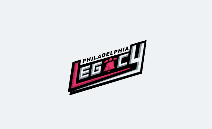
Philadelphia LEgacy
Created a sports brand identity for the Philadelphia WNBA team coming in 2030. This includes deliverables like logos, custom font and numbers, apparel, and advertising.
background
Founded in 2025 and officially revealed as part of the WNBA’s 2030 expansion, the Philadelphia Legacy was created to honor the powerful legacy of women in Philadelphia’s history, trailblazers like Lucretia Mott, Harriet Tubman, Alice Paul, Marian Anderson, Caroline LeCount, etc. The team’s name reflects the enduring strength, resilience, and leadership of the city’s women, both past and present. As part of the Eastern Conference, the Legacy will compete in the Atlantic Division, bringing a fierce new presence to one of basketball’s most historic regions.
Objectives
Convey a sense of grit and strength that correlates with the city and of the women who have historical background in Philadelphia
A cohesive logo, organization name, and mascot to go well with its team apparel
Be robust and functional across all licensing, linear, and digital applications while also being able to work well with different variations
Key thought
The organization’s name, logo, colors, and apparel are all intentionally designed to both reflect Philadelphia culture and honor the impact of historical women from the city’s history to the sport of basketball.
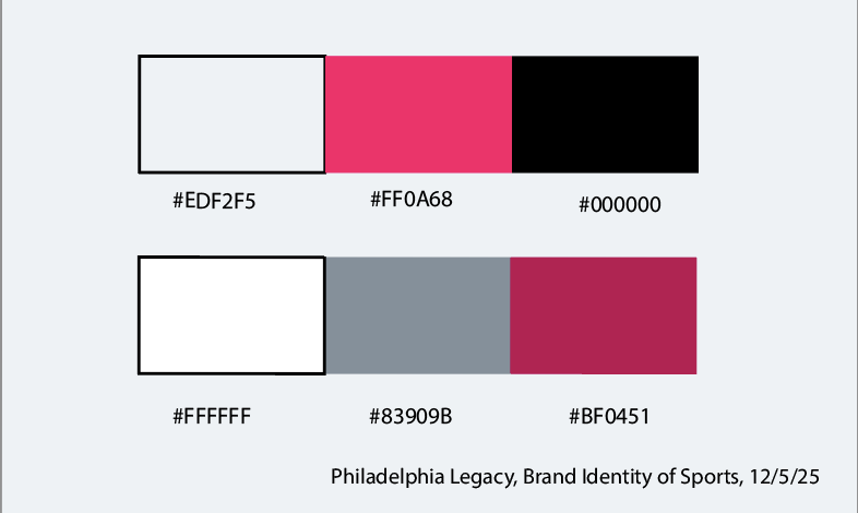
When thinking of the style guide for the team, I wanted to add colors that complemented each other well and that could fit well with the branding of the WNBA. Moreover, I wanted to connect this WNBA team with the Philadelphia 76ers, particularly with the older black, white and red jerseys from the early 2000s. Choosing the hot pink color with black and white helped me to give the brand identity a sense of energy, balance, and brought that connection to the Sixers. With the faint, light blue integrated into the mix, it added a nice touch and helped make the brand feel more whole.
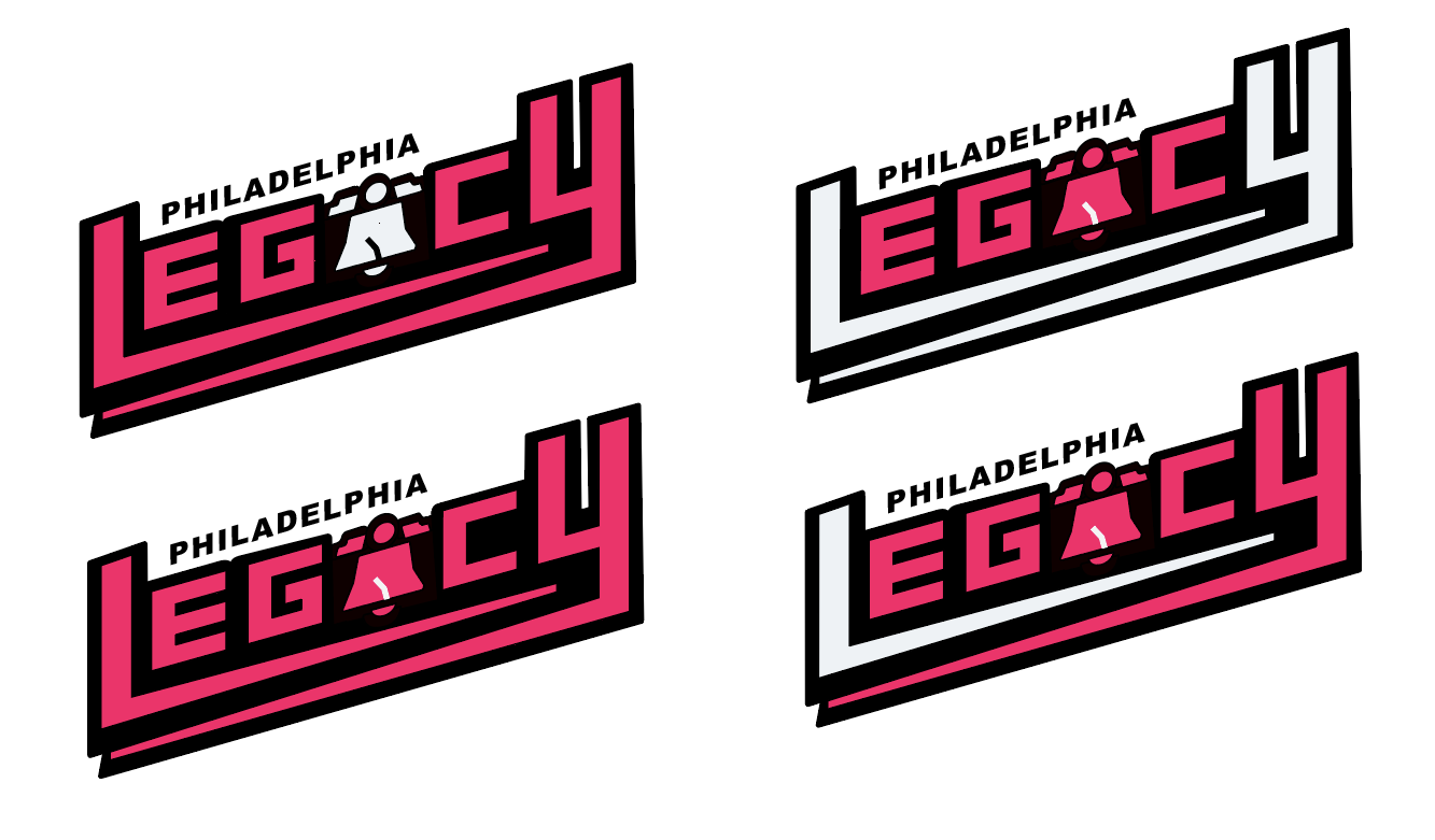
Final primary logo
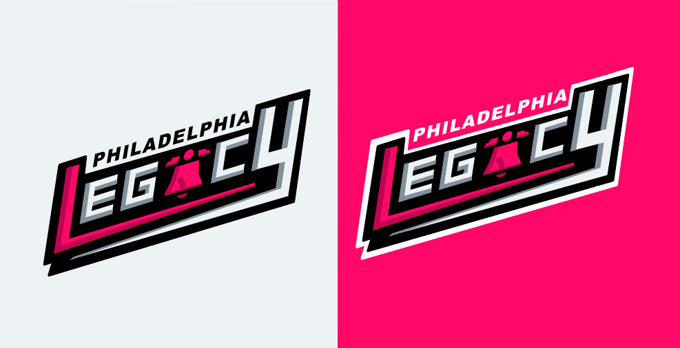
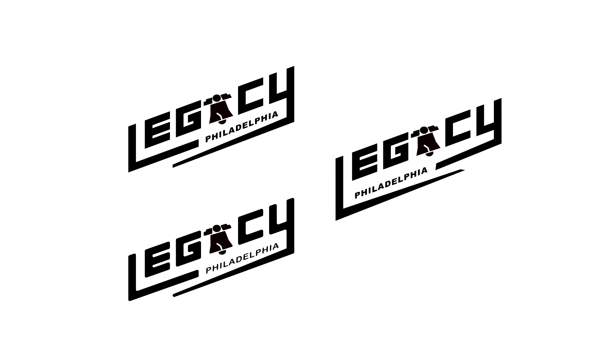
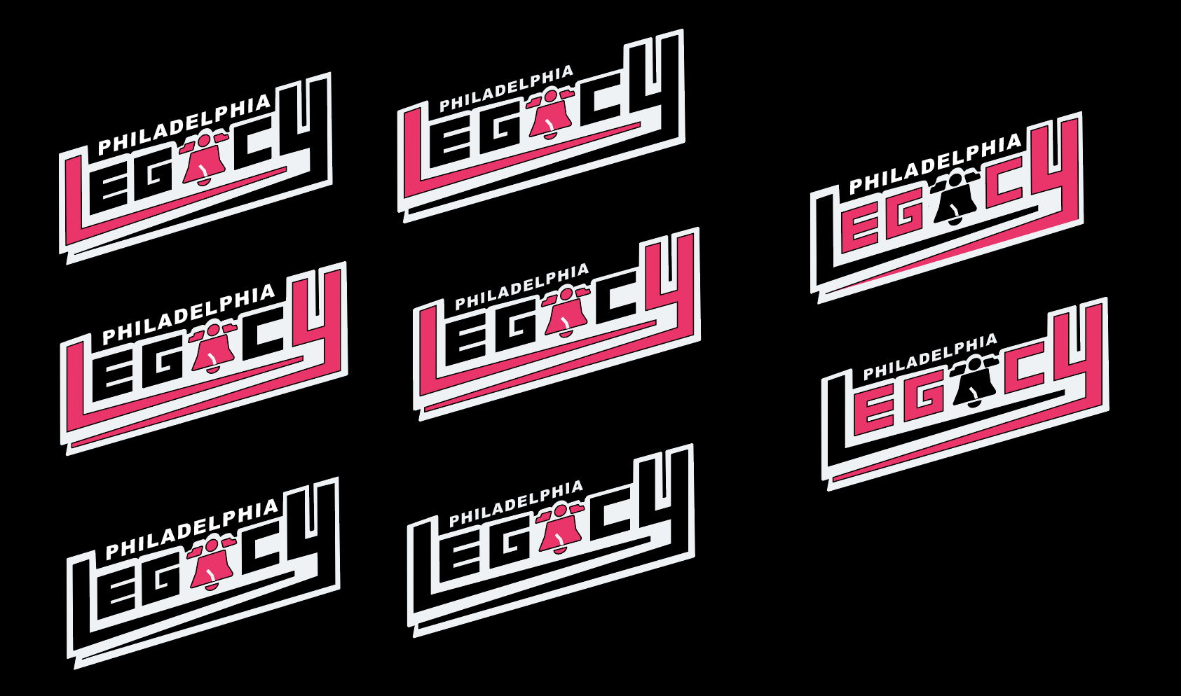
With the Pistons logo from the early 2000s in mind, I decided to skew the team's name, LEGACY, and stretched out the bottoms legs L and the Y toward the middle to create a cool crossover effect in the logo. Additionally, I used the Liberty Bell as an A in LEGACY and put PHILADELPHIA in between the L and Y as a creative solution that added some flair and structure to the logo. I added layers to the logo by adding darker tints of the hot pink and faint, light blue colors to their original colors to add depth to the logo as if it were almost 3D. With the completion of logo, I made other versions that would work well with light and dark backgrounds and with black and white variations to show how it would look like in various screens.
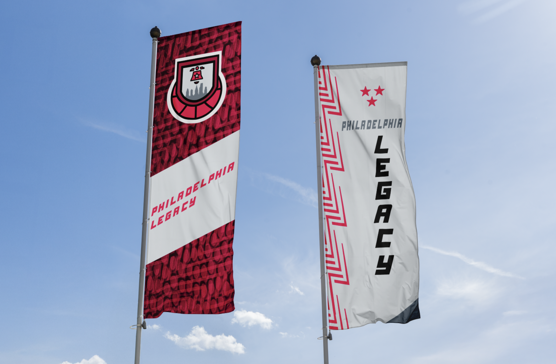
Final Secondary logo
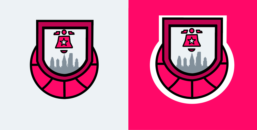
Once I was finished making the primary logo for the brand, I began thinking about what I could do for the secondary logo. I thought that I should continue to use the Liberty Bell for this logo but wanted to add other components to push the narrative of legacy itself and the legacy of the city of Philadelphia. Ultimately, I chose to put the liberty into an emblem, similar to a banner hung up in the rafters in stadiums, with a star and downtown Philadelphia city skyline in it to represent that legacy element to it. In addition to this, I added a basketball below it to make its connection to the sport of basketball.
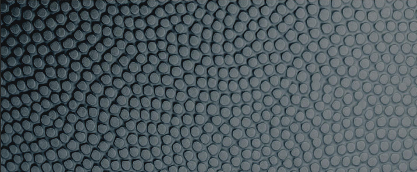
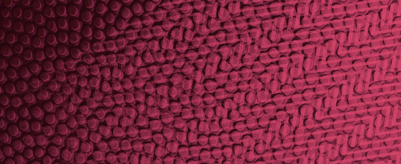
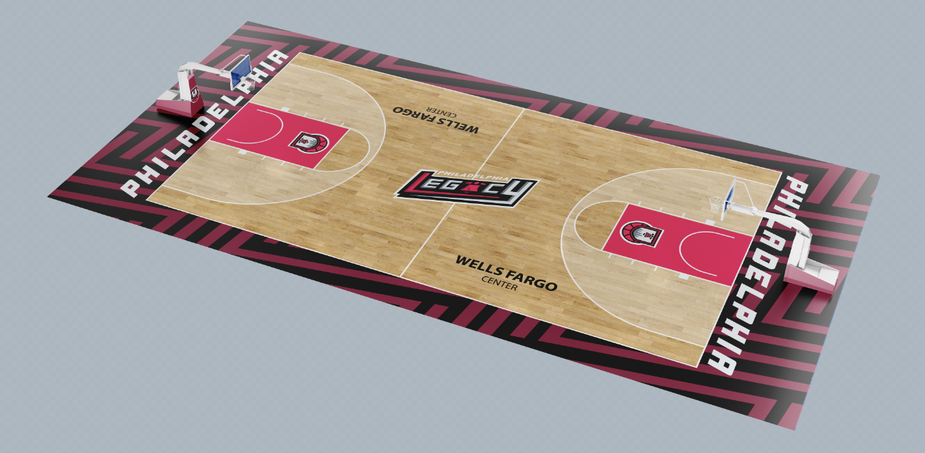
Patterns and textures
The patterns came to mind when I was observing the logo I created for the WNBA team and figuring out how I could manipulate some parts of the logo to create some unique pattern. The L in the logo intrigued me the most so when I began experimenting with what I could do with it, I saw that I could copy, rotate, and flip the L numerous times and came up with this compelling, visually pleasing pattern. As for the textures, I thought to play with the texture of a basketball with the colors of the Philadelphia Legacy team brand. Eventually, I combined the a texture with that L pattern, but instead with dissolved texture and little opacity to create an even more interesting design element.


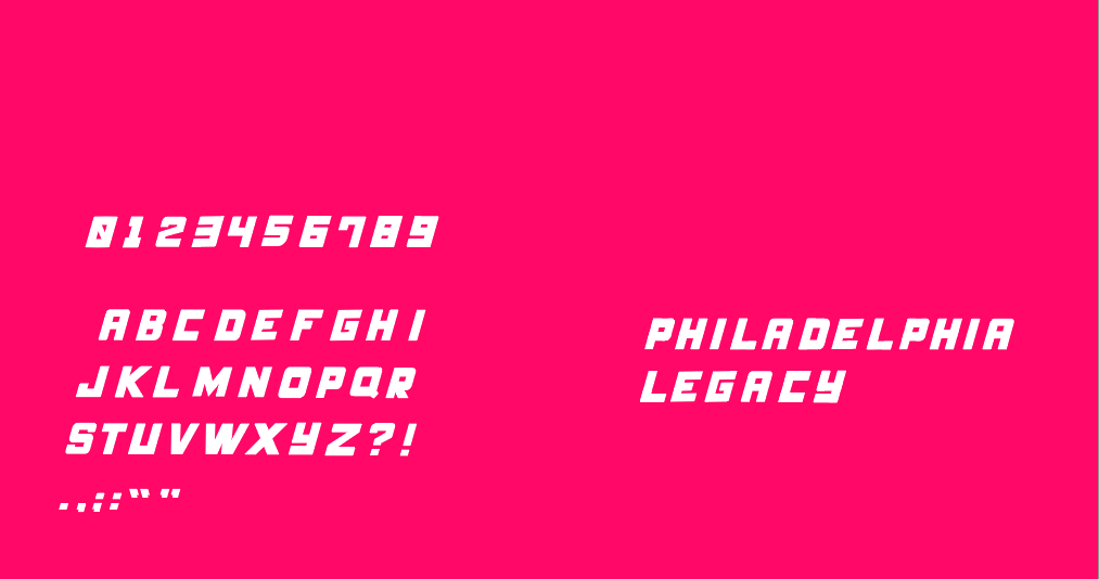
custom font and numbers
The custom font/numbers were meant to both emulate the energy of the logo and to keep the style of the letters in LEGACY consistent for a cohesive alphabet system. With these in mind, I created the alphabet and numbers based only off of how I made the logo and tried to translate it over with proper structure, spacing, and roundness. This was essential to me because when it comes to seeing the name of the team and its branding, I want the type to be able to pull viewers toward the product rather than push them away by spending less time focusing on how I could avoid making my type for the brand generic.
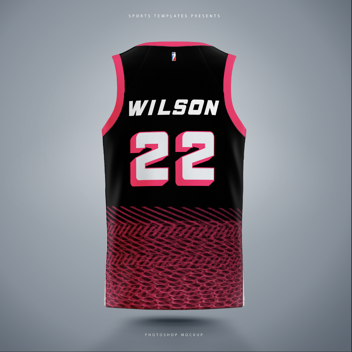
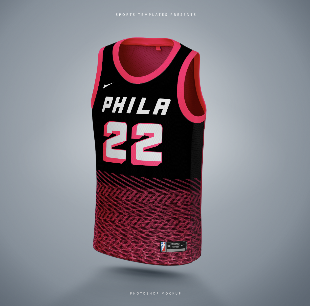
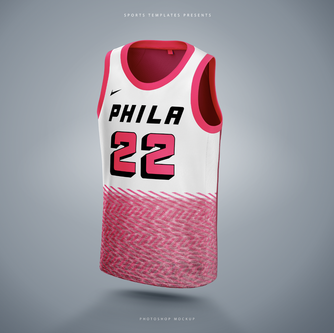
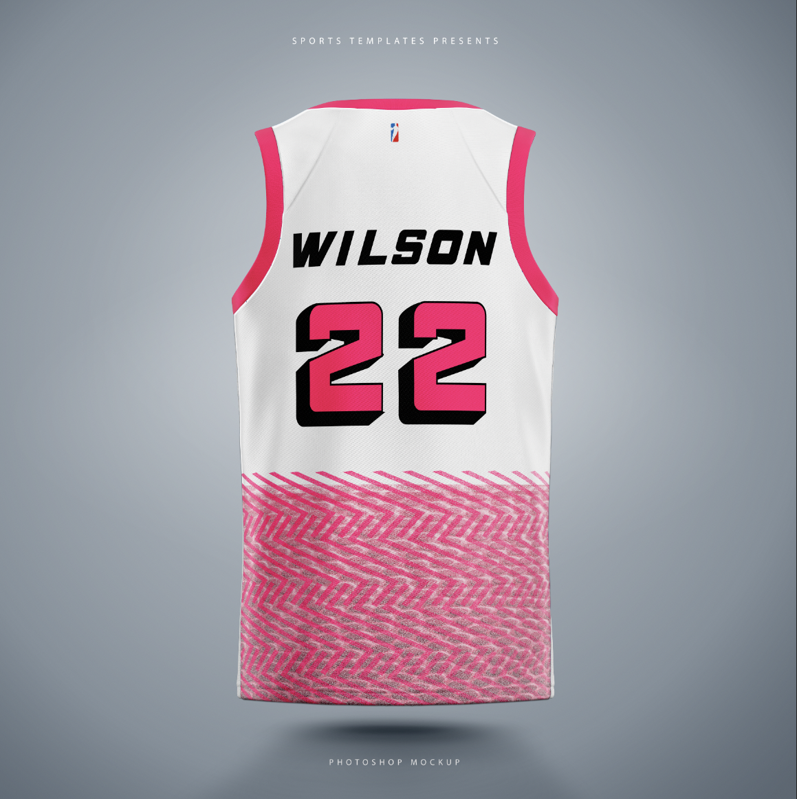
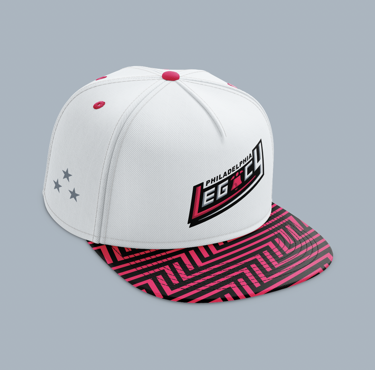
Jersey and optional swag/items mockups
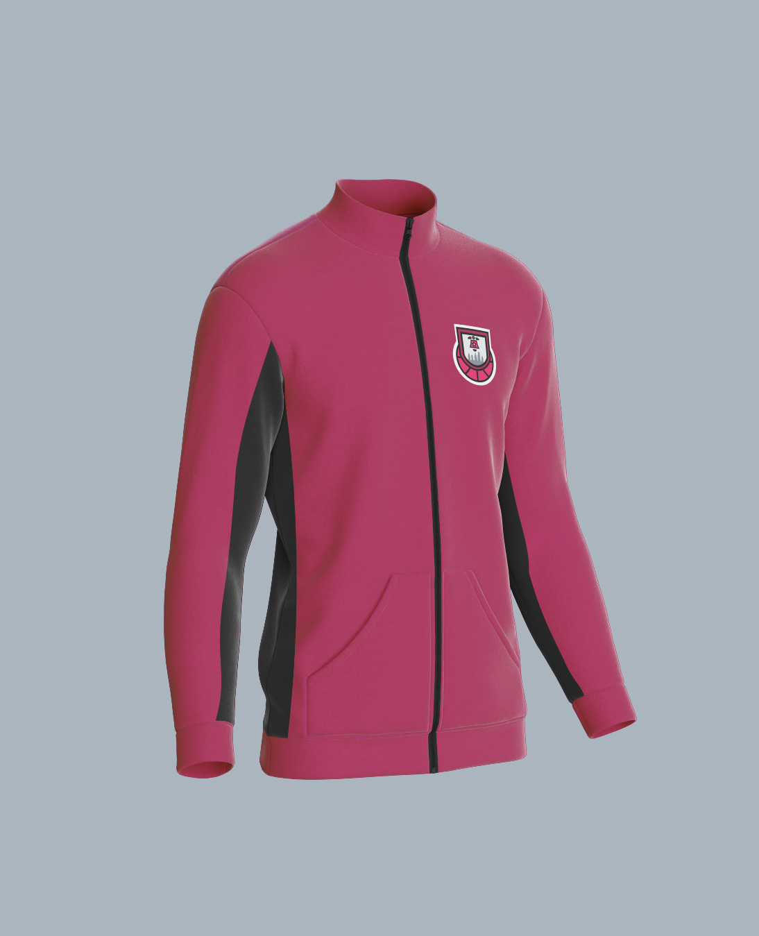
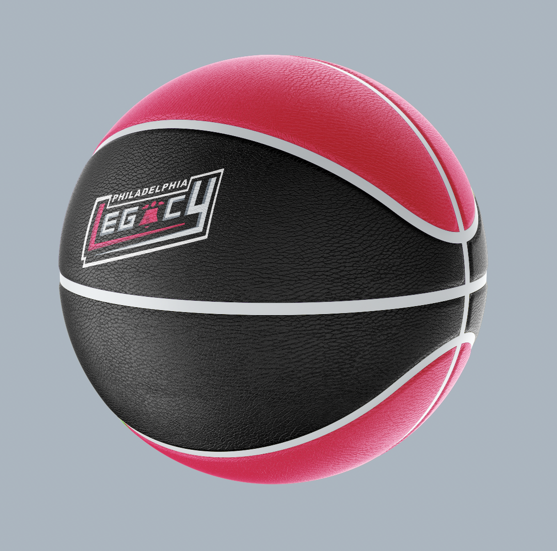
The jerseys were inspired by the New York Liberty jerseys and the late 1990s–early 2000s Indiana Pacers jerseys, particularly their overall aesthetic and typography structure. I drew from the Liberty’s dissolved visual effect and the Pacers’ type layout, then customized a dissolved “L” pattern with a hot pink overlay basketball texture for the bottom of the jerseys. I also took inspiration from the PHILA alternate jerseys used by the Philadelphia 76ers by placing “PHILA” above the numbers and adding depth so the numbers stand out more. The home and away jerseys mirror each other, sharing hot pink interior details, matching trim, and the same dissolved pattern. I also designed basketball warmups using a darker pink from my style guide and the secondary logo to add variety. To promote the team and give fans merchandise, I created a hat and custom basketball, keeping those designs simpler to avoid overcomplicating them.
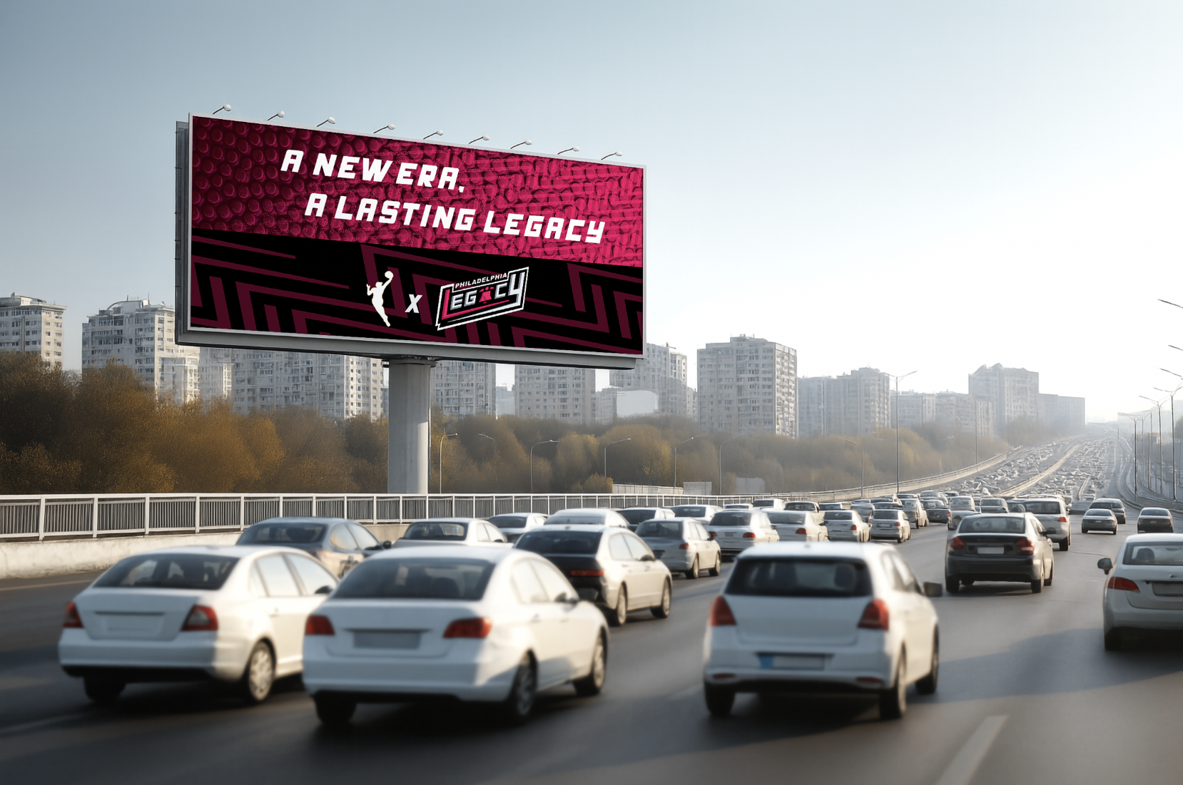
Advertisement mockups
The advertisements for the Philadelphia Legacy are able to showcase all of the components I created throughout the project brought together to promote the team. There was a lot of experimentation with the usage of colors, patterns, textures, and logos and the manipulation of the forms of the type and shapes, resulting in a variety of different designs for each advertisement. This was done to ensure that I would not overuse design elements and to create multiple ways of catching viewers’ attention with a variety of different designs within the same brand identity.
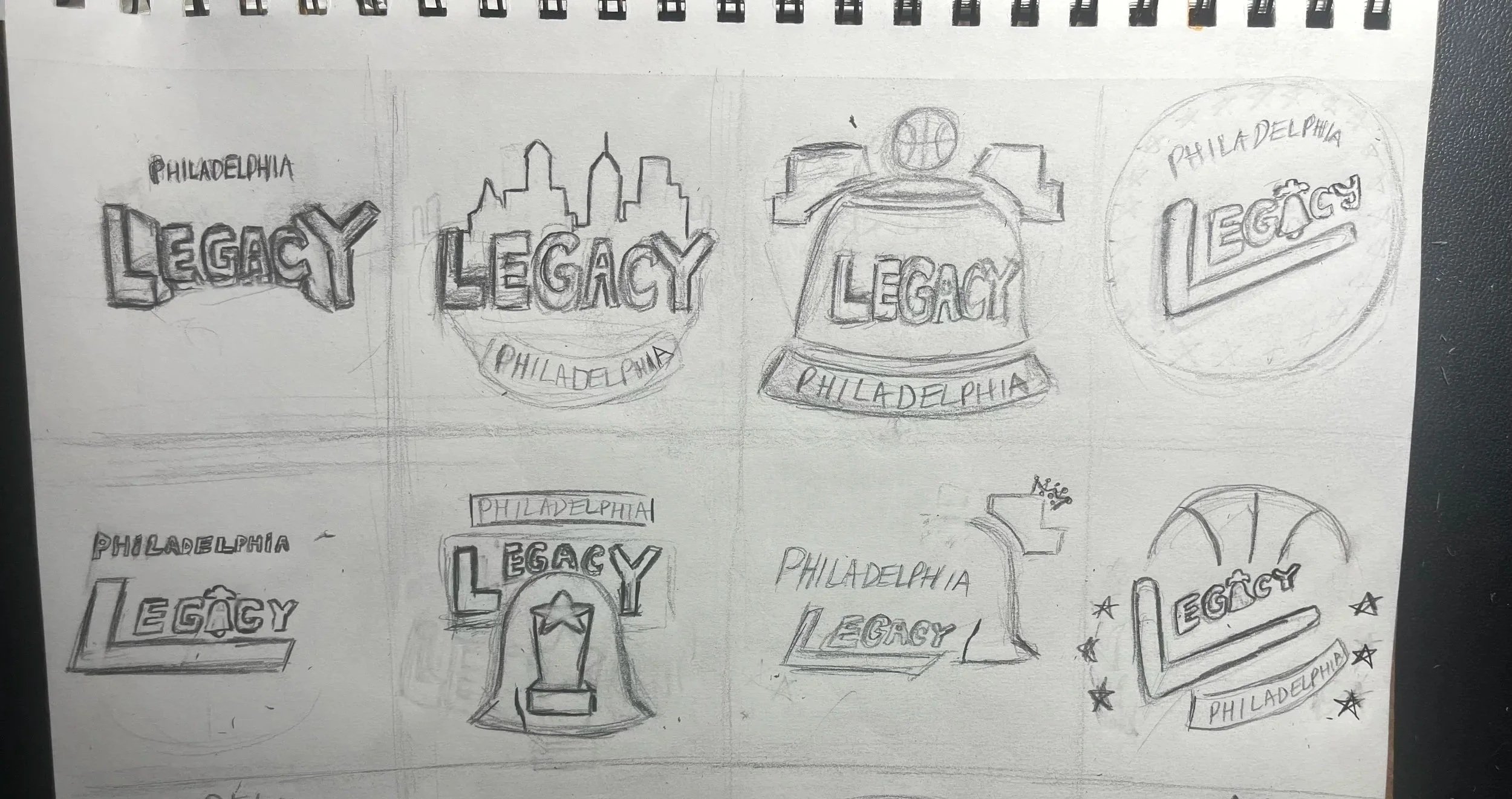
sketches/logo variations
My sketches and logos were inspired by NBA/WNBA logos made and evolved throughout the years. One logo, in particular, that I drew the most inspiration from was the early 2000s Pistons logo with how the logo was skewed and on an angle. From there, I experimented with various concepts and color variations and built up the logo with adding additional elements to add more depth, eventually resulting in the final design.
Conclusion
Creating this project was a fun experience, especially since basketball has always been my favorite sport and something I played growing up. That passion made designing a brand identity for a professional basketball team was exciting, and it was even more motivating knowing the WNBA plans to reveal a Philadelphia team in 2030. The most challenging part was creating and refining the custom alphabet, particularly figuring out the correct spacing, structure, and roundness of the letters and numbers. Through constant experimentation, I was able to improve and finalize the design. The logo came together more easily once I had a clear idea, and it allowed me to make creative design choices while learning new skills. In the end, I’m very happy with how the project turned out and would love to create more sports design projects like this in the future.
Credits
Instructor: Joe Bosack
School: Tyler School of Art and Architecture